# Tooltips
{% embed url="" %}
## Usage
When activated, tooltips display a text label identifying an element, such as a description of its function.
### Principles
#### Transient
Tooltips appear on hover, focus, or touch, and disappear after a short duration.
#### Paired
Tooltips are always paired nearby the element with which they are associated.
#### Succinct
Tooltips only include short, descriptive text.
## Placement
200% zoom
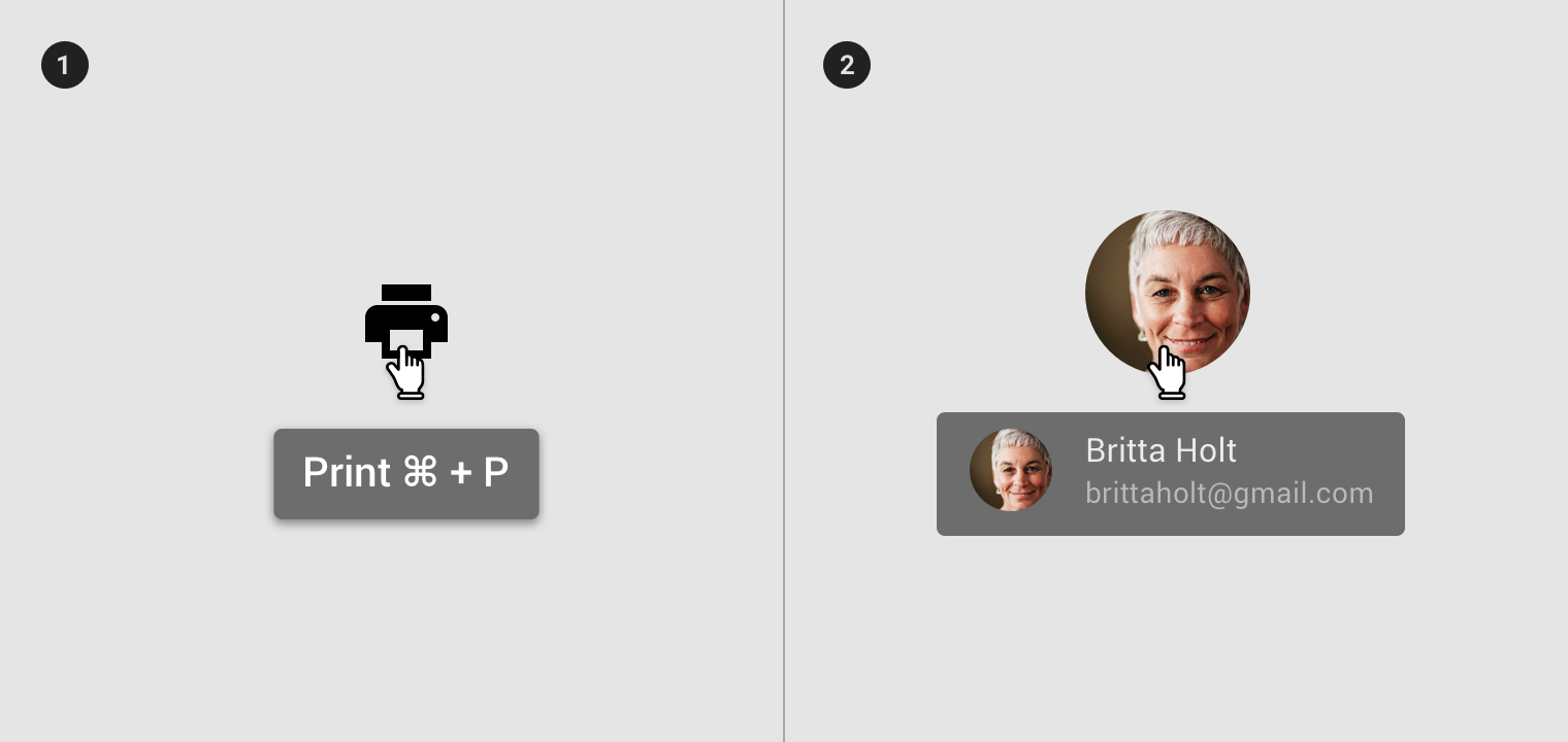
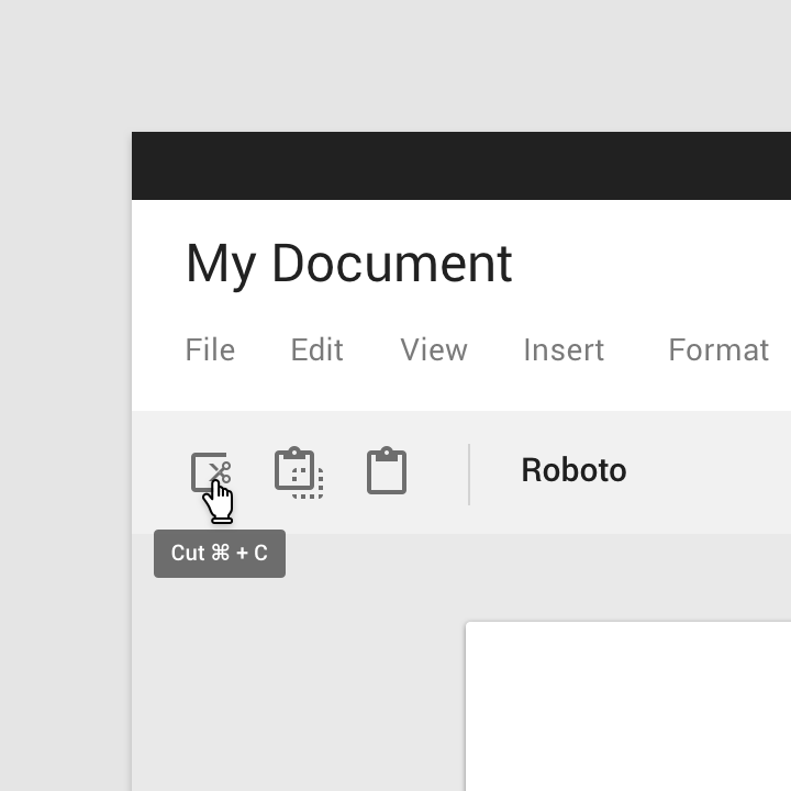
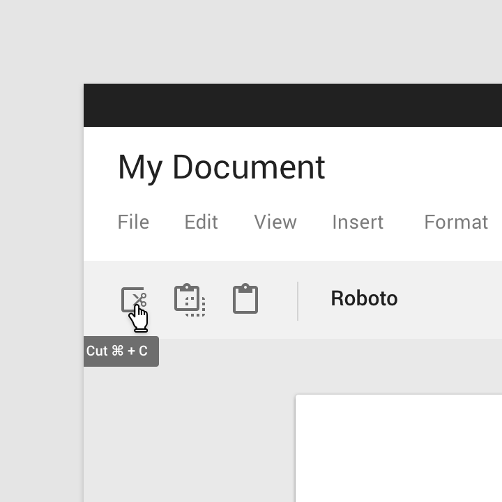
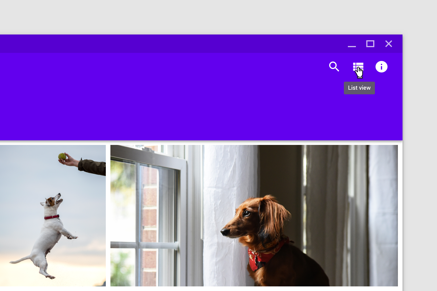
1. On hover
2. On focus
200% zoom
1. On hover
2. On focus
200% zoom
1. Tooltips describe differences between similar elements
2. Tooltips distinguish actions with related iconography
1. Don’t display shadows on tooltips
2. Don’t display rich information and imagery on tooltips
### Desktop
###
### Mobile
{% embed url="" %}
Tooltip displayed through long press
{% endembed %}
{% embed url="" %}
Tooltip summoned through focus (Android only)
{% endembed %}
## Behavior
A tooltip is displayed upon tapping and holding a screen element or component (on mobile) or hovering over it (desktop). Continuously display the tooltip as long as the user long-presses or hovers over the element.
### Timing
Display the tooltip for 1.5 seconds. If the user takes another action before that time ends, the tooltip will disappear.
### Motion
Over 150ms, tooltips fade in and scale up using the deceleration curve. They fade out over 75ms.
{% embed url="" %}
1\. 200% 2. 100%
{% endembed %}
On desktop, tooltips appear in the center of click targets and stay in place while cursor moves within the target.
{% embed url="" %}
1\. Tooltip disappears when cursor moves out of the touch target 2. Tooltip remains while cursor moves within the touch target
{% endembed %}