Menus
Menus display a list of choices on temporary surfaces.
Last updated
Was this helpful?
Menus display a list of choices on temporary surfaces.
Last updated
Was this helpful?
A menu displays a list of choices on a temporary surface. They appear when users interact with a button, action, or other control.
Menus should be easy to open, close, and interact with.
Menu content should be suited to user needs.
Menu items should be easy to scan.
Menus allow users make a selection from multiple options. They are less prominent and take up less space than selection controls, such as a set of radio buttons.
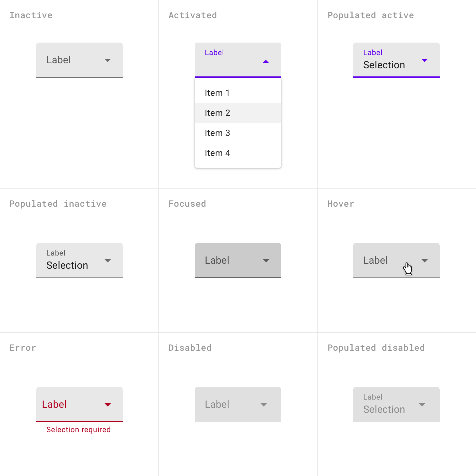
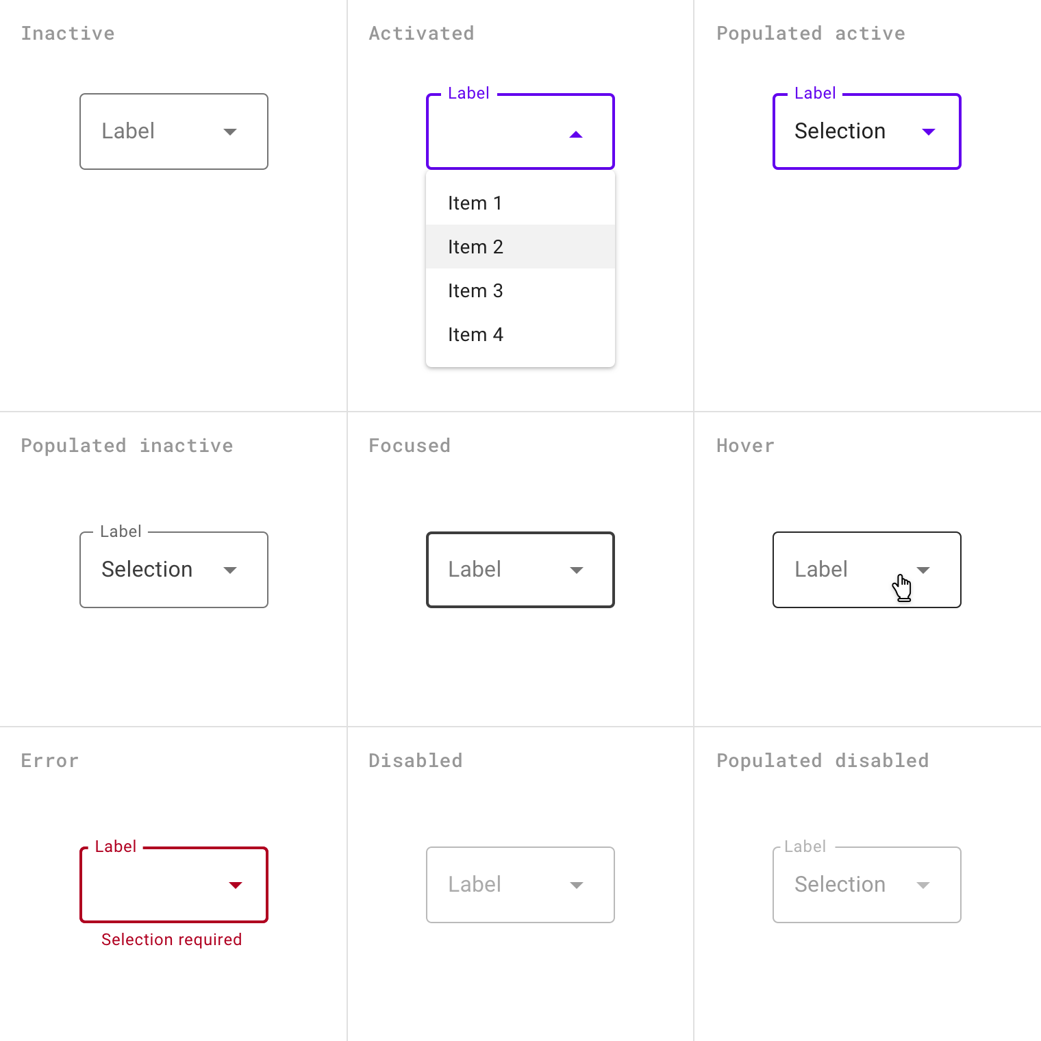
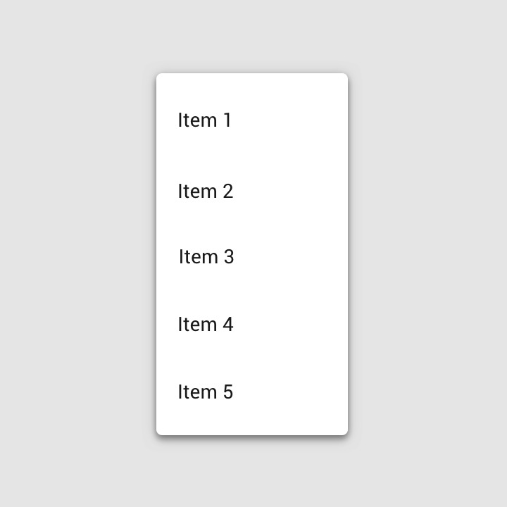
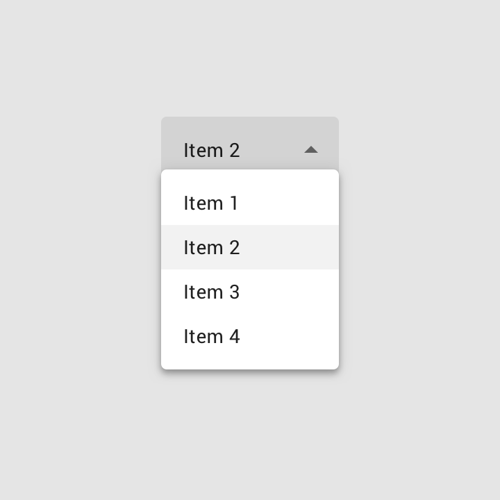
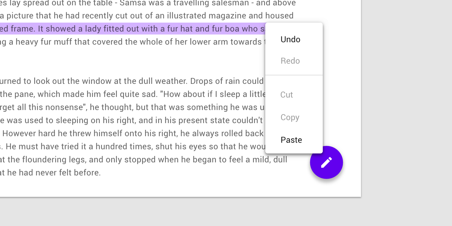
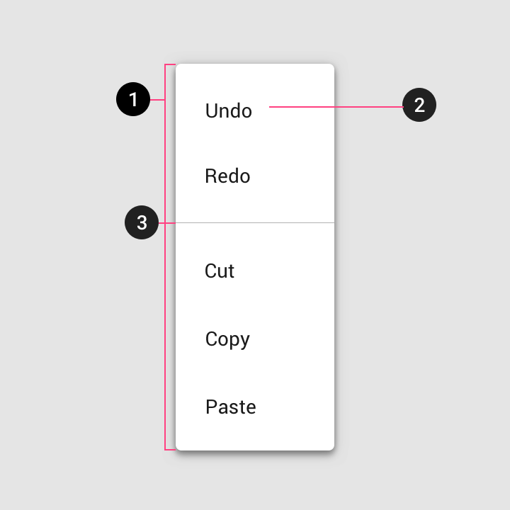
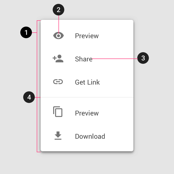
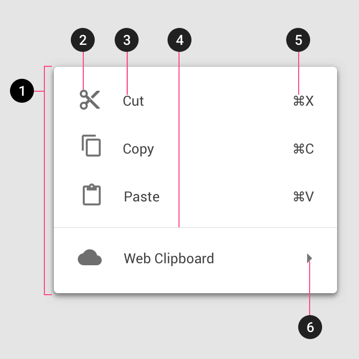
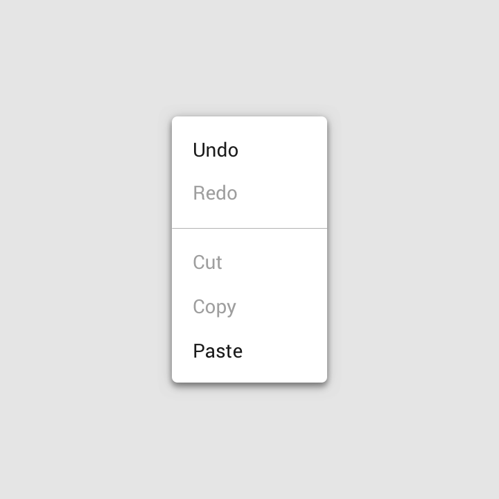
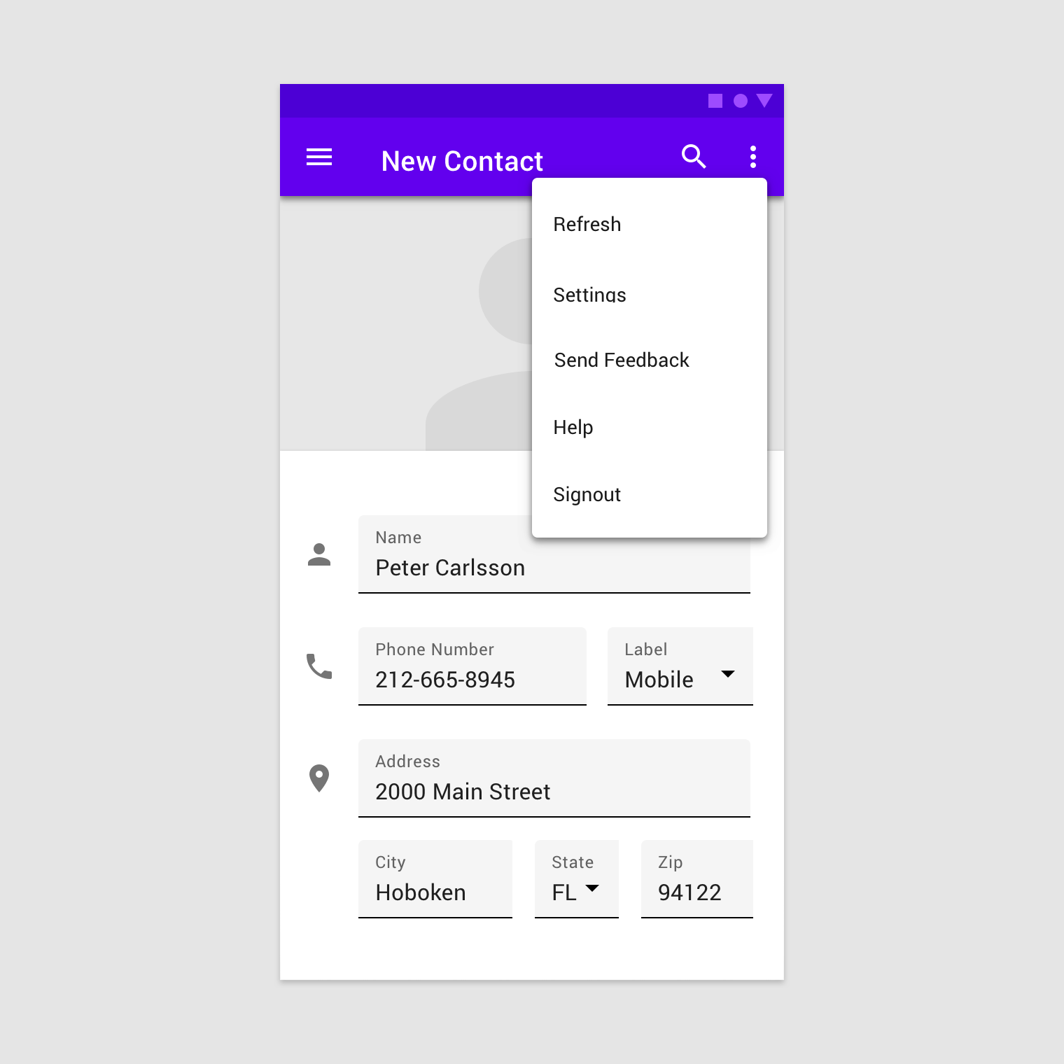
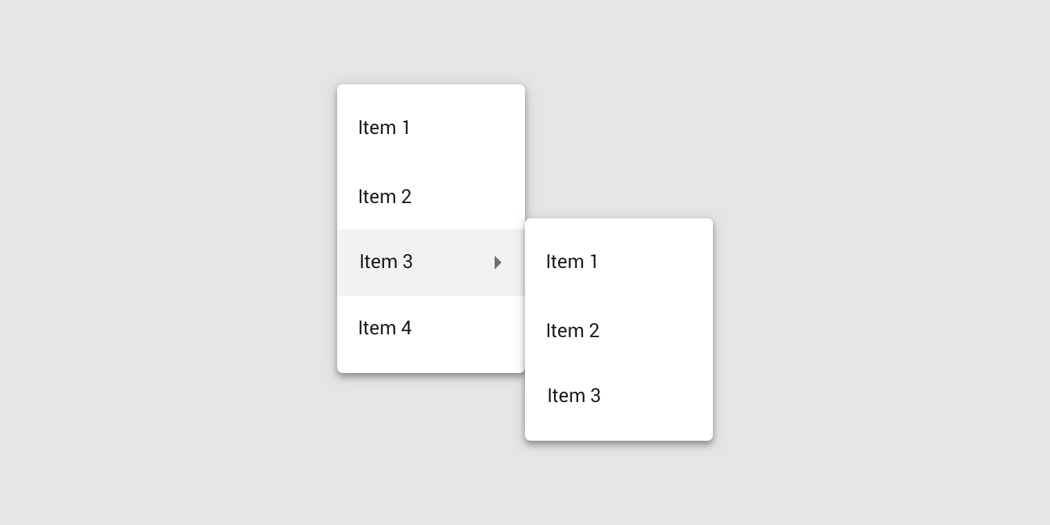
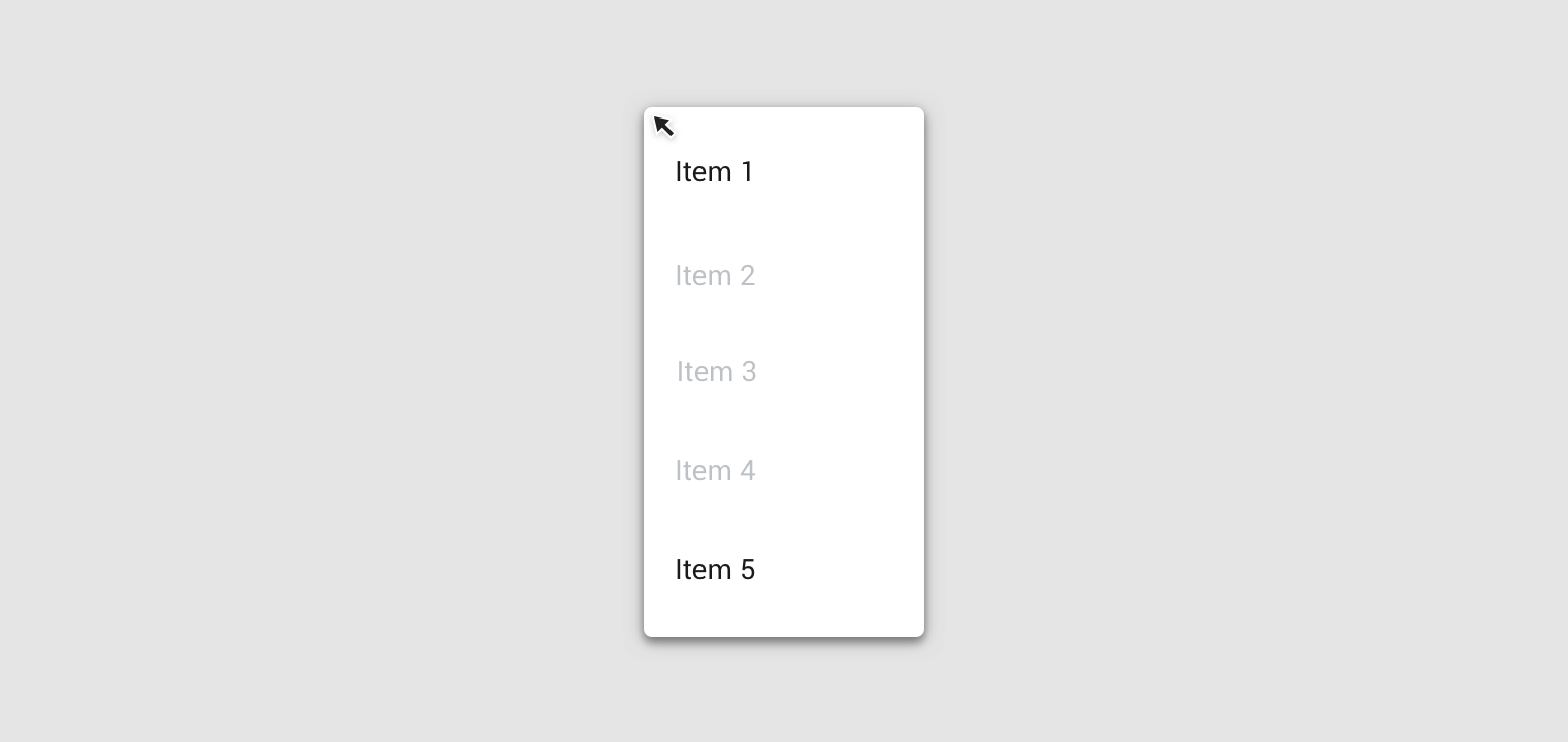
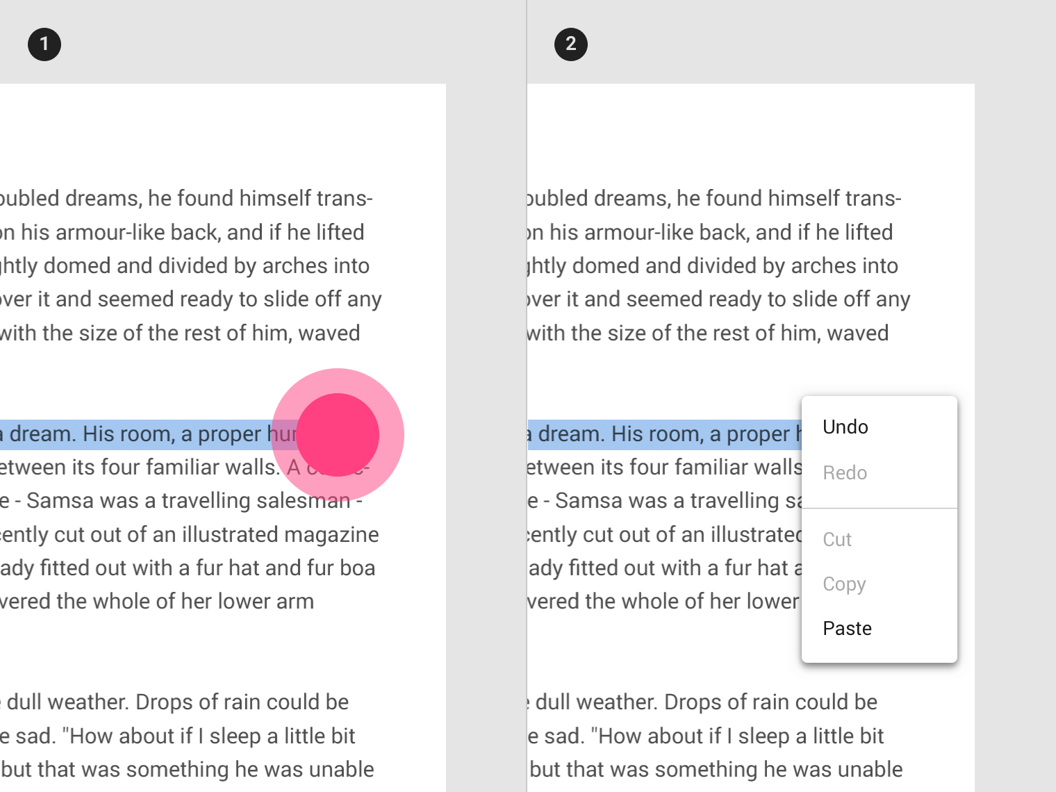
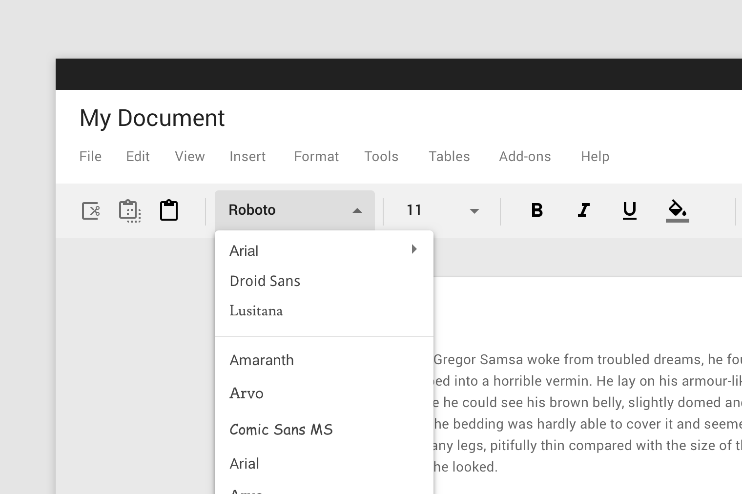
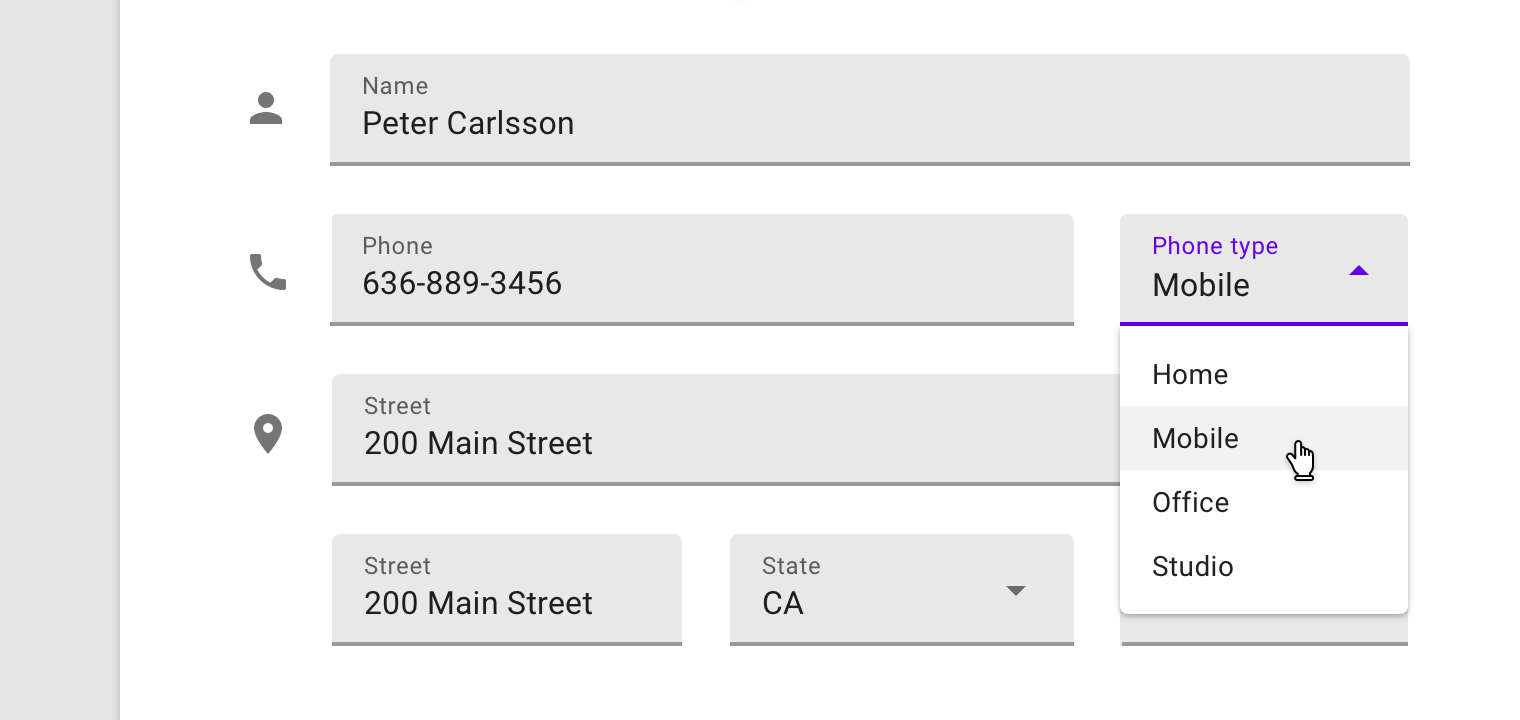
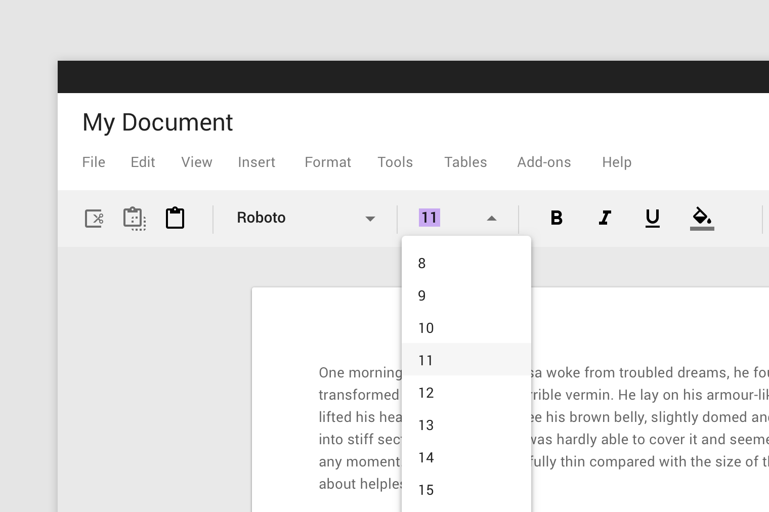
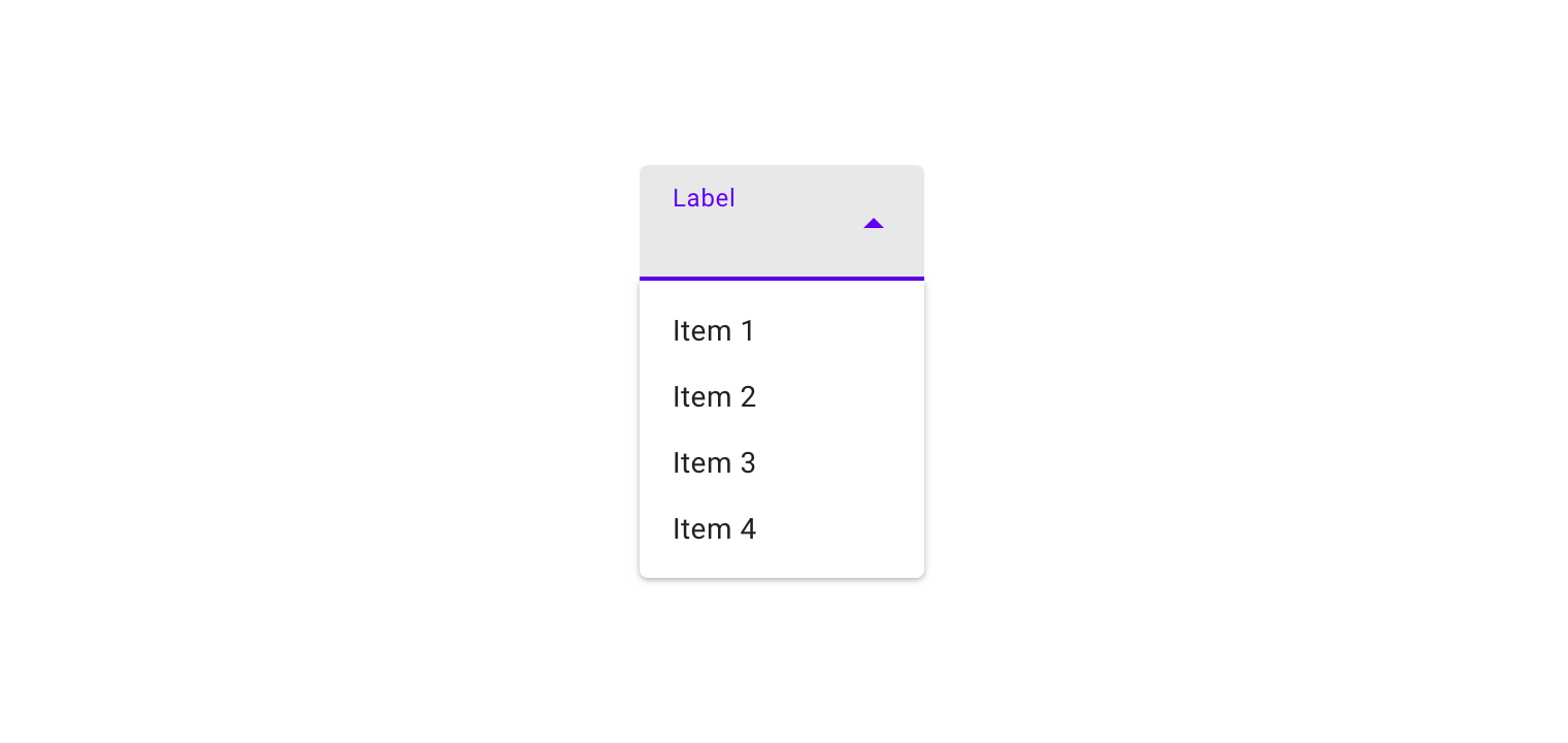
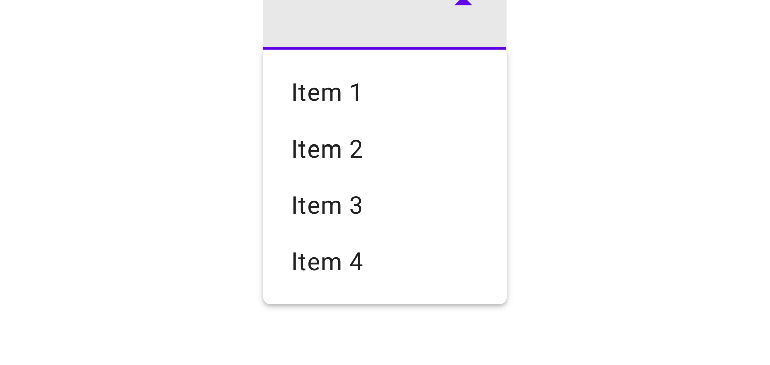
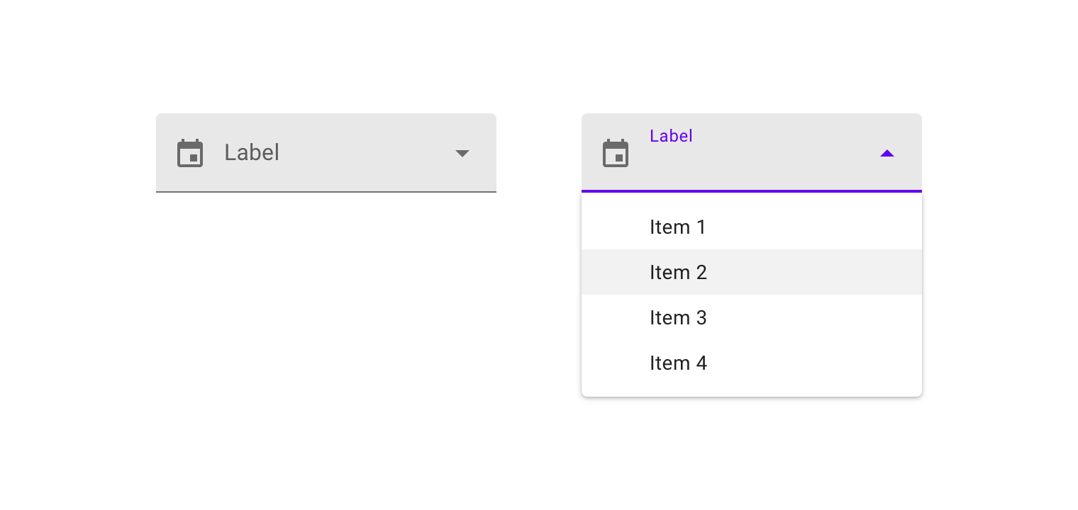
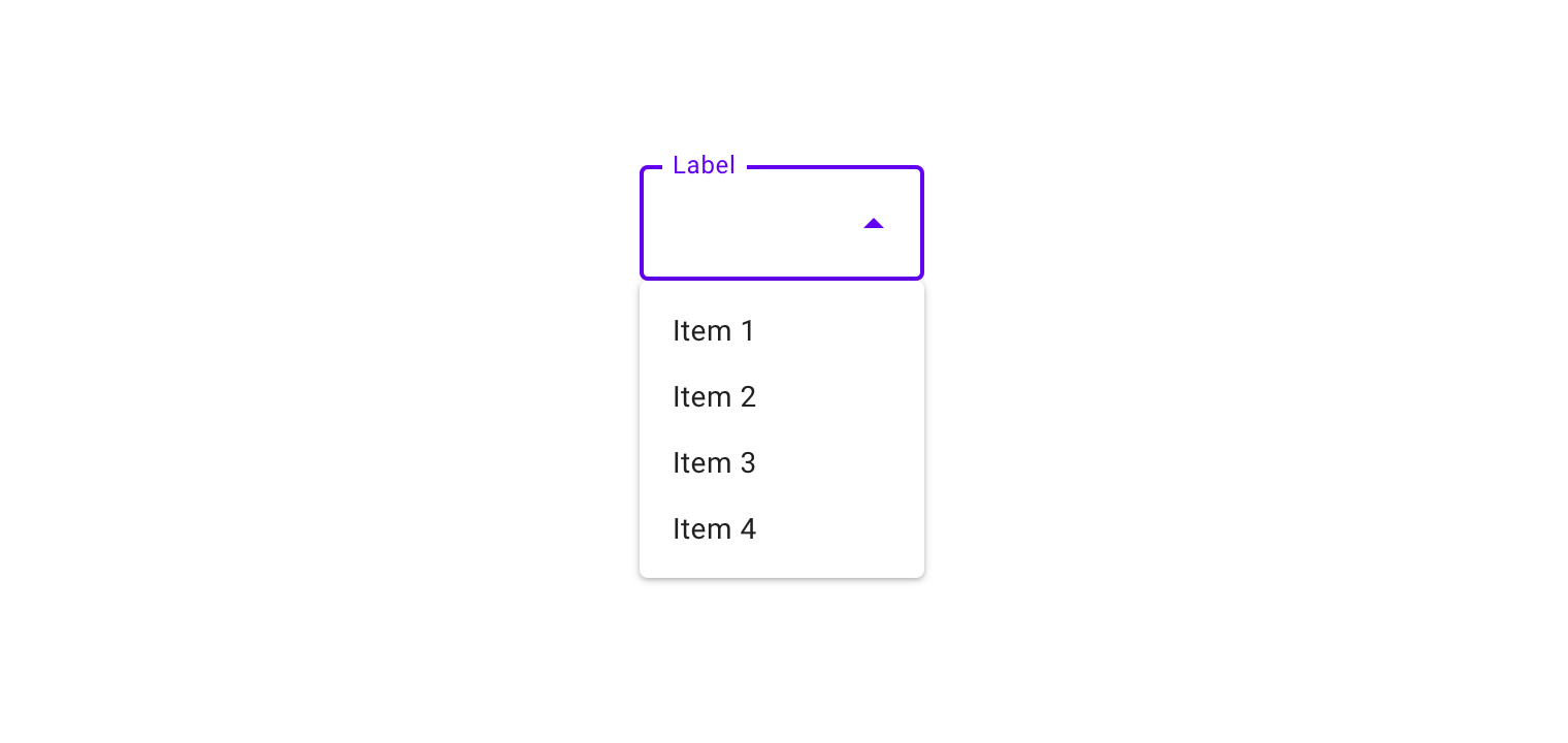
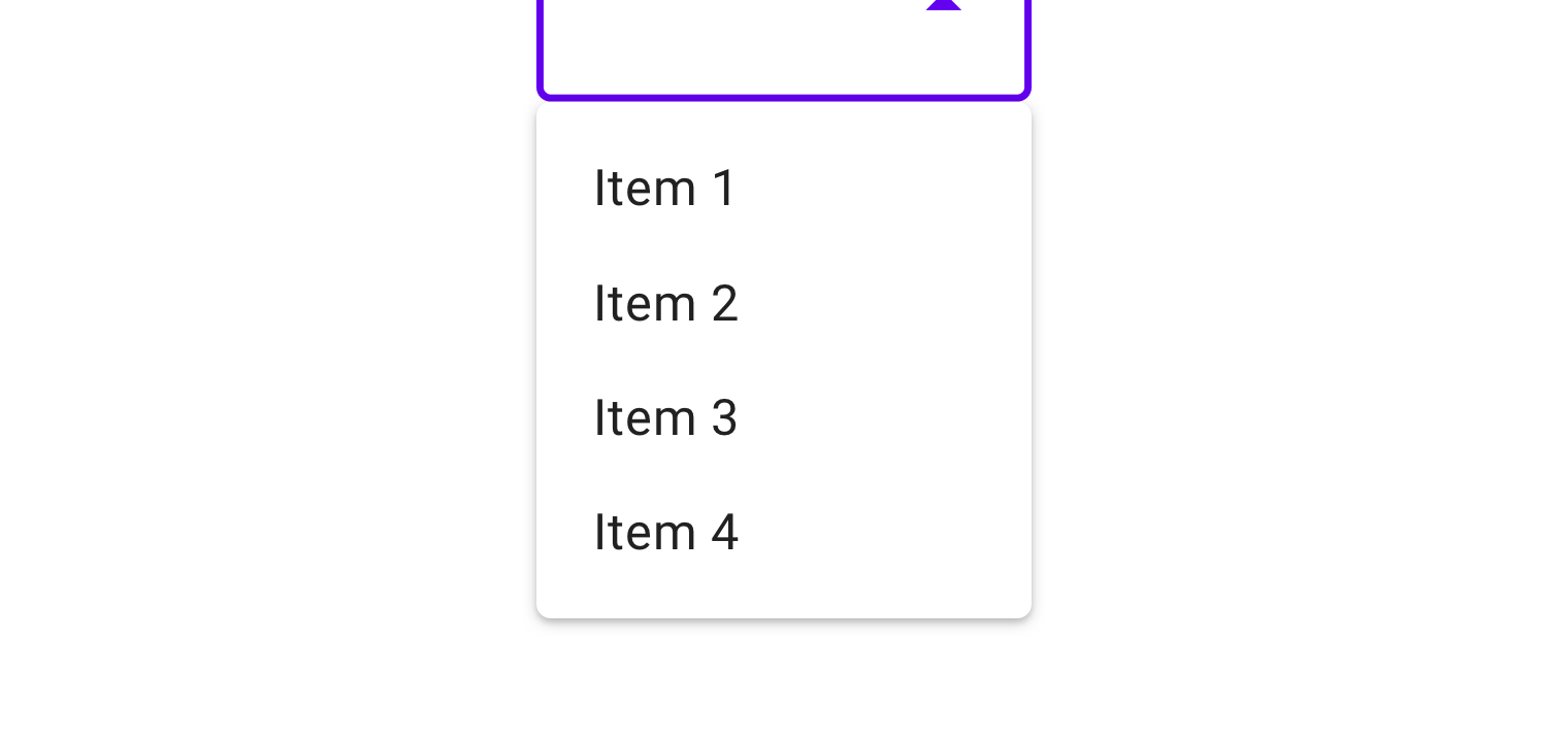
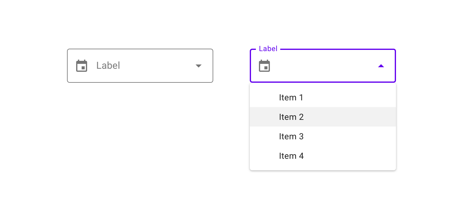
Dropdown menus display a list of options, triggered by an icon, button, or action. Their placement varies based on the element that opens them.
Exposed dropdown menus display the currently selected menu item above the list of options. Some variations can accept user-entered input.
Menus appear in front of all other permanent UI elements. The maximum height of a menu should be at least one row less than the...READ MORE
Menus appear in front of all other permanent UI elements.
The maximum height of a menu should be at least one row less than the height of the app’s UI.
Menus should be positioned relative to the edge of the screen or browser. They typically appear next to (or in front of) the element that generates them. If they are in a position to be cut off by the browser or screen’s edge, the menu can instead appear to the left, right, or above the element that generates it.
Menus display lists of related options (which can be grouped together) as well as unrelated options. Menus appear when a user taps an interactive UI element such as an icon, button, action, or content, such as selected items or text.
Text list
Container
Text
Divider
Text and icon list
Container
Leading icon
Text
Divider
Text, icon, and keyboard command list
Container
Leading icon
Text
Divider
Command
Cascading menu indicator
Text with selection state list
Selection state
Display actions as disabled when they can only be used sometimes, under certain conditions. They should be displayed as disabled rather than removing them.
If not all menu items are displayed at once, menus can be scrollable. In this state, menus show a persistent scrollbar.
Menus open using a scale animation (an animation that shows an element grow in size). The animation creates a relationship between the menu and the action that generates the menu.
A menu’s position on screen affects where and how it will appear. If opened at the top of the screen, it will expand downwards (to avoid being cropped).
By default, menus open with an entrance animation. However, on desktop, menus can skip the animation and open instantly instead.
A dropdown menu is a compact way of displaying multiple choices. It appears upon interaction with an element (such as an icon or button) or when users perform a specific action.
Dropdown menus are positioned relative to both the element that generates them and the edges of the screen or browser. They can appear in front of, beside, above, or below the element that generates them.
A dropdown menu is typically positioned below the element that generates it.
Cascading menus allow users to choose from a large variety of choices, by displaying menus with multiple levels of hierarchy.
They are organized into menus of parent list items that contain child list items. Child list items appear to right or left of parent list items, depending on where there is room to expand child list items.
Contextual menus aren’t triggered by a consistent UI element. They appear next to where a user taps, and their actions can vary based on the tap target.
When an option is chosen from a dropdown menu, the element that generates it remains the same.
Exposed dropdown menus display the currently selected menu item above the menu.
They can be used only when a single menu item can be chosen at a time.
Upon selecting an item, an exposed dropdown menu updates to display that item. In some cases, it can accept and display user input (whether or not it’s listed as a menu choice).
Filled exposed dropdown menu states
1. Inactive 2. Activated 3. Inactive and populated
Outlined exposed dropdown menu states
1. Inactive 2. Activated 3. Inactive and populated
An exposed dropdown menu is positioned below the element that generates the dropdown. Alternatively the filled and outlined variations can open a native picker.
An exposed dropdown menu can be customized to have a different appearance or behavior.
An editable dropdown menu displays the currently selected menu item above the menu. A user can enter a value that’s not listed in the menu. You can restrict the types of values that users can enter to certain types. For example, you can set the menu to only accept positive numbers.
A filled dropdown menu looks like a filled text field. It displays the currently selected menu item above the menu.
The menu container corners furthest from the menu control have a 4dp radius.
When using a leading icon with a filled dropdown menu, the floating label and the menu items must be aligned with one another.
An outlined dropdown menu looks like an outlined text field. It displays the currently selected menu item above the menu.
For outlined dropdown menus, all corners of the menu container have a 4dp radius.
Forms with outlined dropdown menus should align the menu label with the icon.