Snackbars

Snackbars provide brief messages about app processes at the bottom of the screen.

Usage

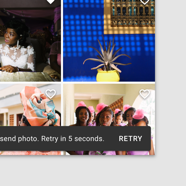
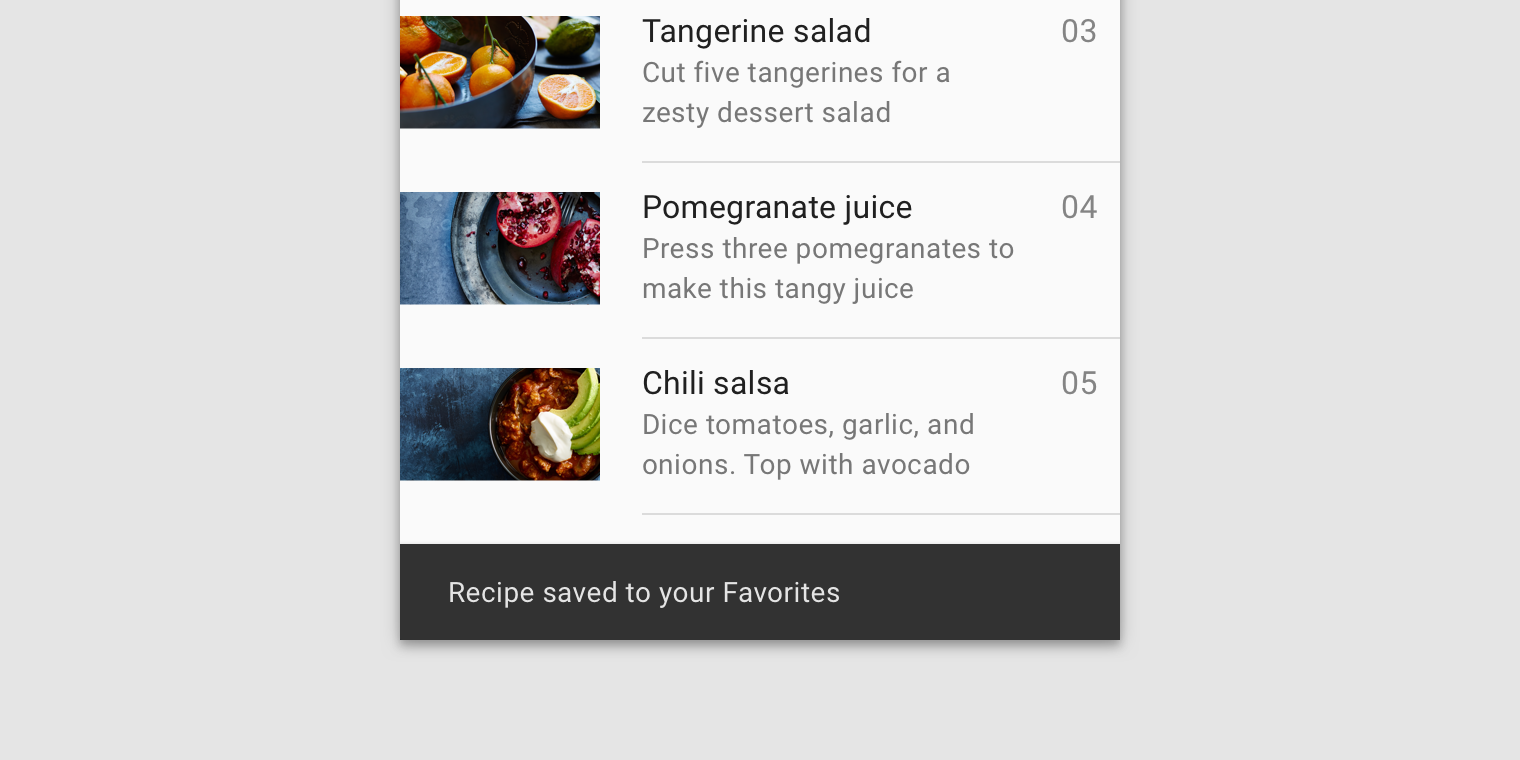
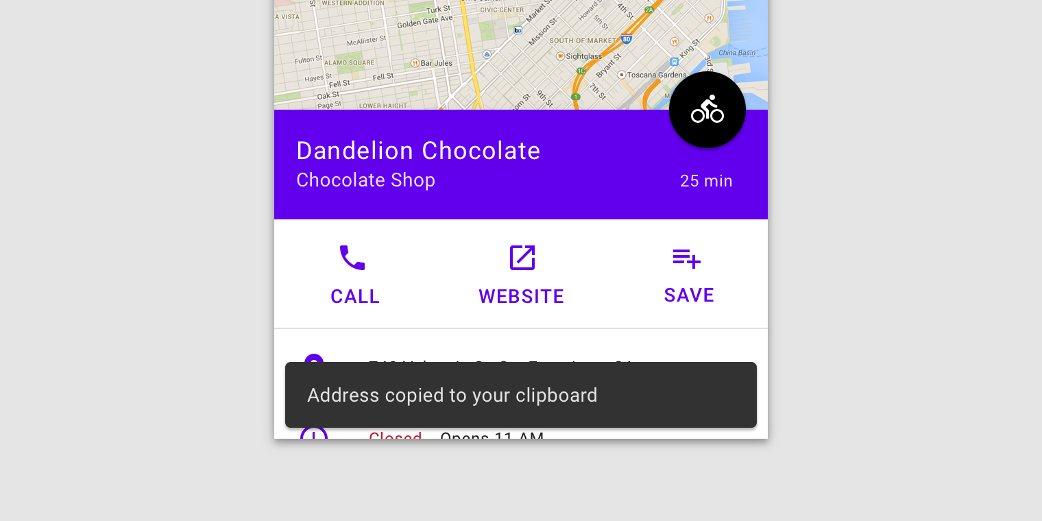
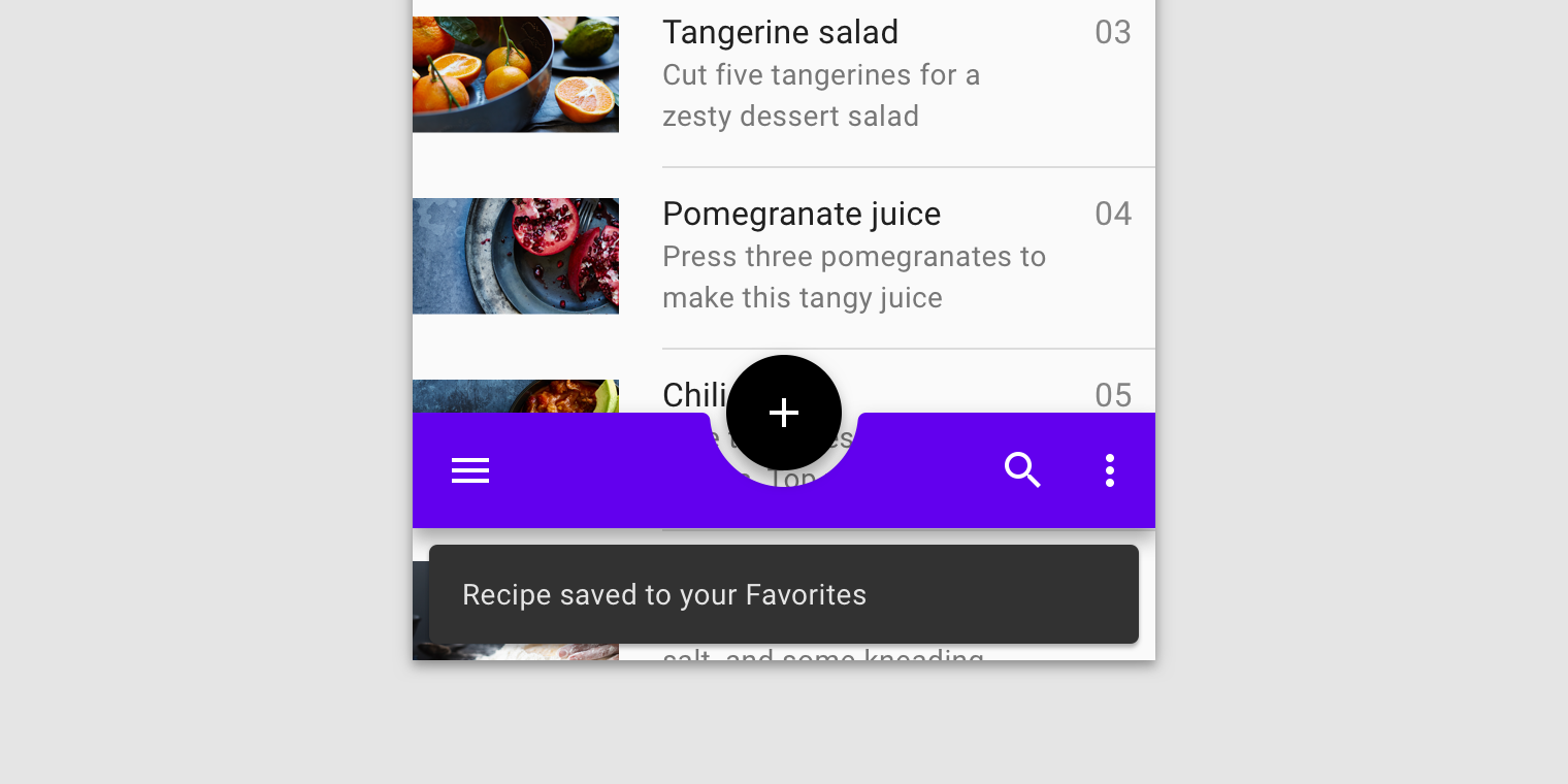
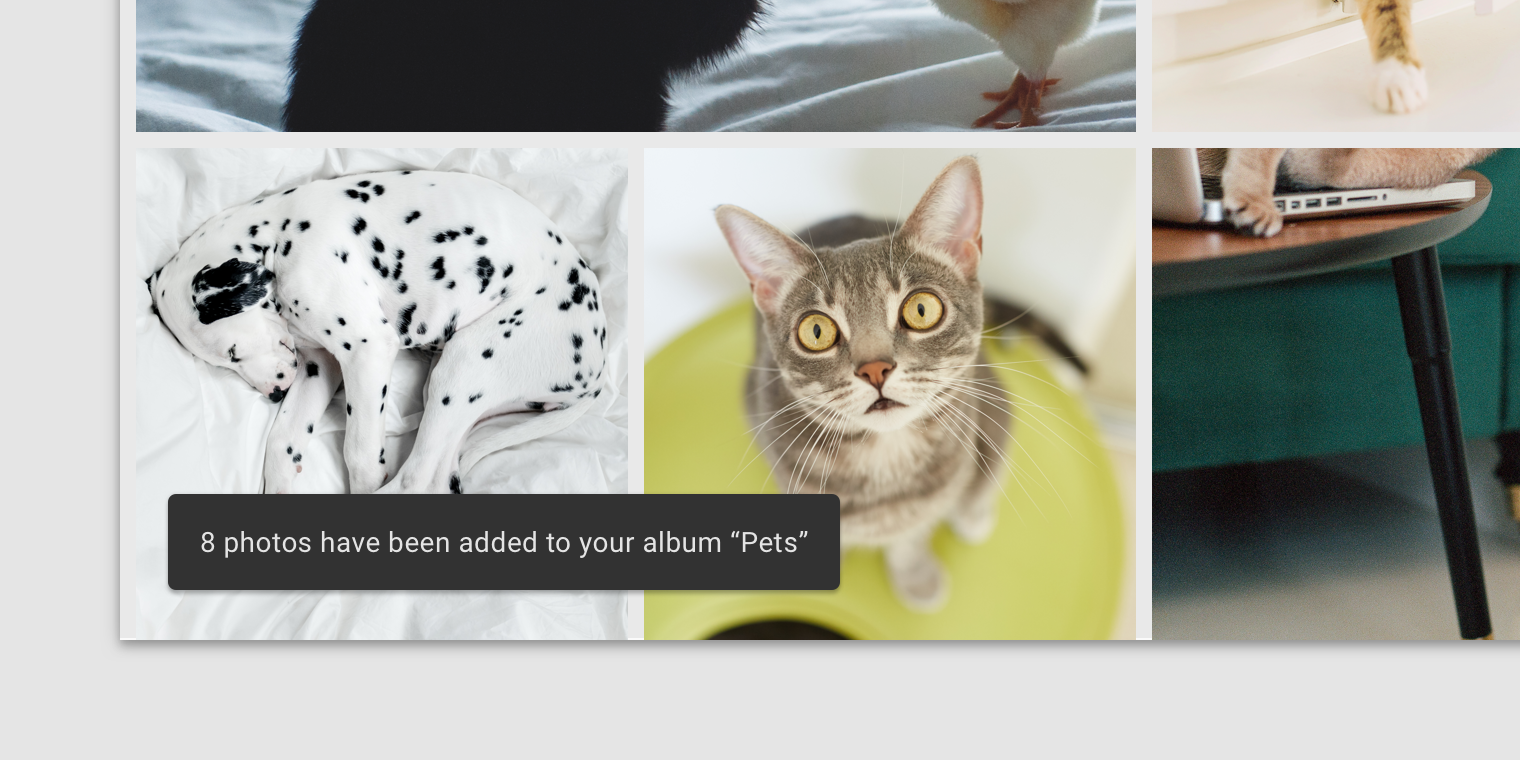
Snackbars inform users of a process that an app has performed or will perform. They appear temporarily, towards the bottom of the screen. They shouldn’t interrupt the user experience, and they don’t require user input to disappear.

Frequency

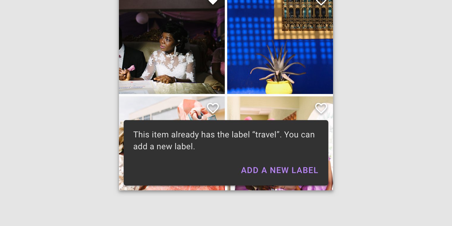
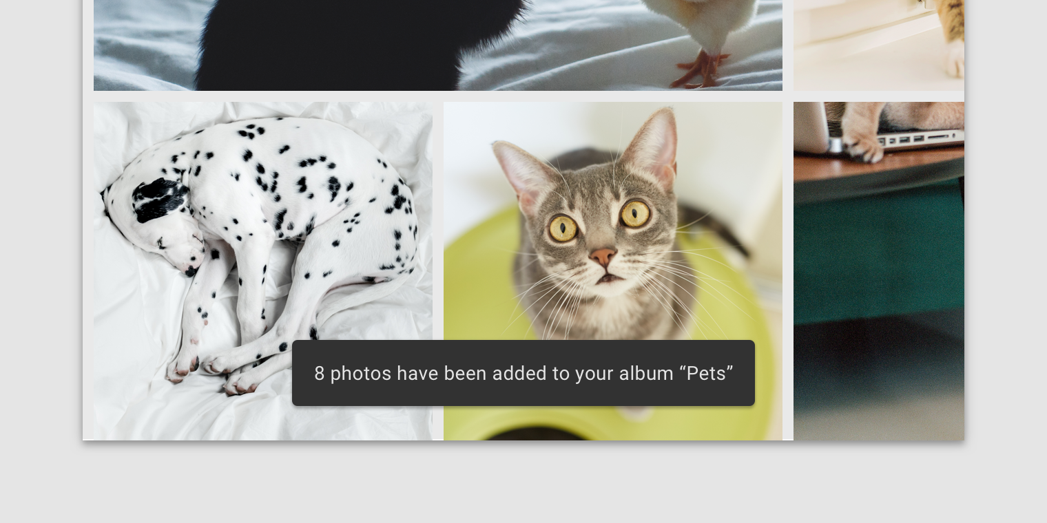
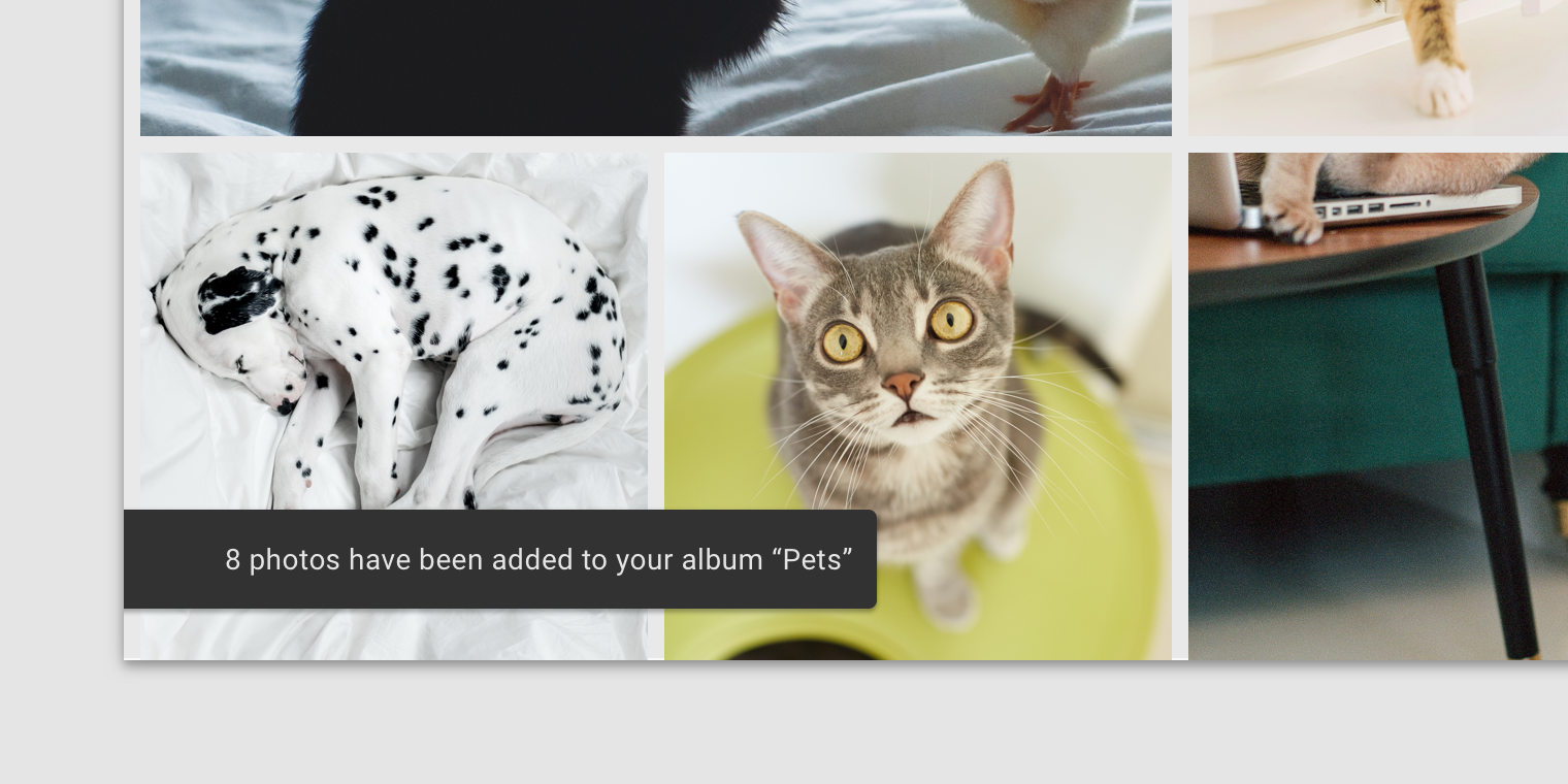
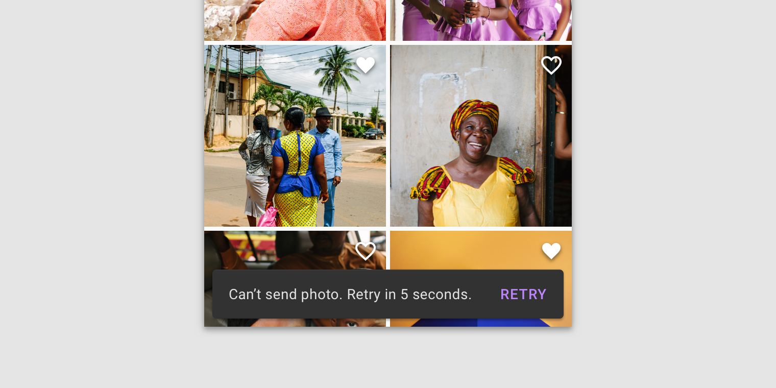
Only one snackbar may be displayed at a time.

Actions

A snackbar can contain a single action. Because they disappear automatically, the action shouldn’t be “Dismiss” or “Cancel.”

Principles

Informational

Snackbars provide updates on an app’s processes.

Temporary

Snackbars appear temporarily, and disappear on their own without requiring user input to be dismissed.

Contextual

Snackbars are placed in the most suitable area of the UI.

When to use

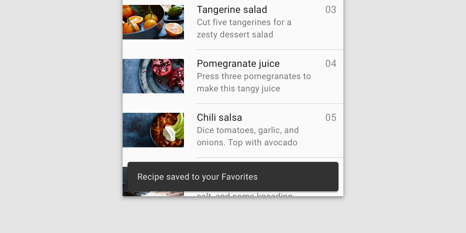
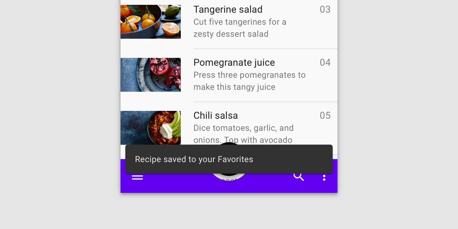
Snackbars communicate messages that are minimally interruptive and don’t require user action.

Component

Priority

User action

Snackbar

Low priority

Optional: Snackbars disappear automatically

Banner

Prominent, medium priority

Optional: Banners remain until dismissed by the user, or if the state that caused the banner is resolved

Dialog

Highest priority

Required: Dialogs block app usage until the user takes a dialog action or exits the dialog (if available)

Anatomy

1. Text label

2. Container

3. Action (optional)

Text label

Snackbars contain a text label that directly relates to the process being performed. On mobile, the text label can contain up to two lines of text.

Text labels are short, clear updates on processes that have been performed.
【Do】On mobile, use up to two lines of text to communicate the snackbar message.
【Do】In wide UIs like desktop and tablet, snackbars should have only a single line of text.
【Don’t】Don’t place icons in snackbars. If your message needs an icon, consider using an alert.

Container

Snackbars are displayed in rectangular containers with a grey background. Containers should be completely opaque, so that text labels remain legible.

【Do】Snackbar containers use a solid background color with a shadow to stand out against content.
【Do】In wide layouts, extend the container width to accommodate longer text labels.
【Caution】An app can apply slight transparency to the container background, as long as text remains clearly legible.
【Don’t】Avoid significantly altering the shape of a snackbar container.
【Don’t】Avoid displaying a snackbar container without elevation.

Action

Snackbars can display a single text button that lets users take action on a process performed by the app. Snackbars shouldn’t be the only way to access a core use case, to make an app usable.

To distinguish the action from the text label, text buttons should display colored text.
【Don’t】The text label shouldn’t share the same color as the text button.
Don’t. Don’t use a filled or elevated button in a snackbar, as it draws too much attention.
【Do】If an action is long, it can be displayed on a third line.
【Do】To allow users to amend choices, display an "Undo" action.
【Caution】A dismiss action is unnecessary, as snackbar disappears on their own by default.

Behavior

Appearing and disappearing

Snackbars appear without warning, and don't require user interaction. They automatically disappear from the screen after a minimum of four seconds, and a maximum of ten seconds.

Consecutive snackbars

When multiple snackbar updates are necessary, they should appear one at a time.

Consecutive snackbars should appear above persistent bottom navigation.

【Don’t】Avoid stacking snackbars on top of one another.
【Don’t】Don’t animate other components along with snackbar animations, such as the floating action button.

Placement

At the bottom of the UI

Snackbars should be placed at the bottom of a UI, in front of app content. Avoid placing a snackbar in front of frequently used touch targets or navigation.

Place a snackbar in front of content.
【Don’t】Avoid placing snackbars in front of navigation components.

Snackbars can span the entire width of the screen only when a UI does not use persistent navigation components like app bars or bottom navigation bars. Snackbars that span the entire width of a UI can push only FABs up when they appear.

【Caution】Snackbars can span the entire width of a UI. However, they should not appear in front of navigation or other important UI elements like floating action buttons.

Snackbars and floating action buttons (FABs)

Snackbars should appear above FABs.

Snackbar above a FAB
【Don’t】Don’t place a snackbar in front of a FAB.
【Don’t】Don’t place a snackbar behind a FAB.

Snackbars should appear directly above persistent footer elements.

Snackbar above persistent footer elements
【Do】Place snackbars in front of medium extended sheets.
【Don’t】Avoid pushing bottom persistent elements up when snackbars appear.

Snackbars in wide layouts

In wide layouts, snackbars can be left-aligned or center-aligned if they are consistently placed on the same spot at the bottom of the screen.

【Don’t】Avoid placing snackbars flushed to one edge of the layout.
【Don’t】Avoid placing consecutive snackbars side by side or next to one another.

Last updated

Was this helpful?