> For the complete documentation index, see [llms.txt](https://zyun.gitbook.io/temporary-views/llms.txt). Markdown versions of documentation pages are available by appending `.md` to page URLs; this page is available as [Markdown](https://zyun.gitbook.io/temporary-views/official/material-design/original/navigation-drawer.md).

# Navigation drawer

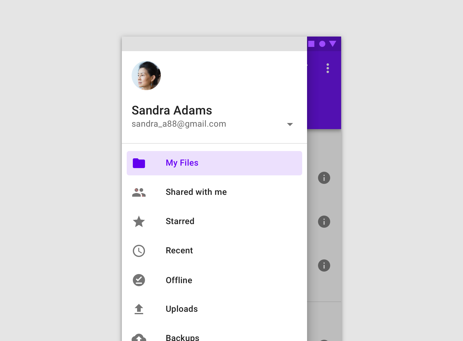
Navigation drawers provide access to destinations in your app.

{% embed url="<https://material.io/components/navigation-drawer/>" %}

![](https://storage.googleapis.com/spec-host-backup/mio-components%2Fassets%2F1nsuL8VDpBW_LZYXgabK1H0uq6icmmKYt%2Fnav-drawer-intro.png)

## Usage&#x20;

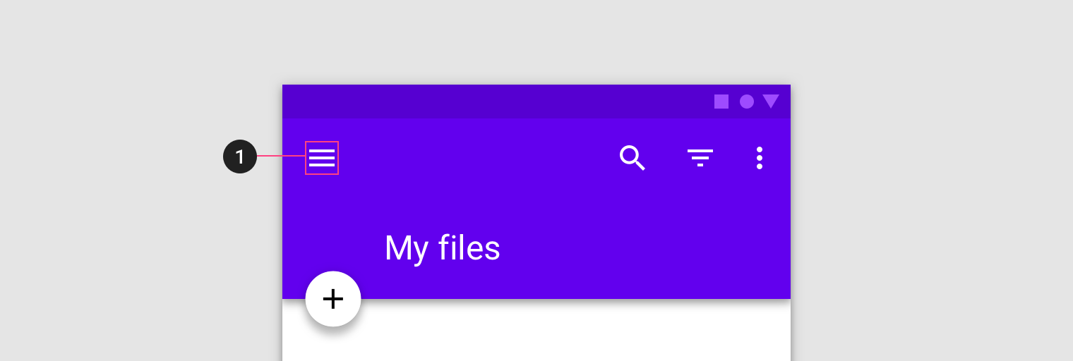
Navigation drawers provide access to destinations and app functionality, such as switching accounts. They can either be permanently on-screen or controlled by a navigation menu icon.

Navigation drawers are recommended for:

* Apps with five or more top-level destinations
* Apps with two or more levels of navigation hierarchy
* Quick navigation between unrelated destinations

<div align="left"><img src="https://storage.googleapis.com/spec-host-backup/mio-components%2Fassets%2F1JkhpaOoDpFrCKLLoZMmbfiBMofzKS-lY%2Fusage-do.png" alt="【Do】Use a navigation drawer for five or more primary destinations."></div>

<div align="left"><img src="https://storage.googleapis.com/spec-host-backup/mio-components%2Fassets%2F1bJV0wyvGnpAyj8_59cYD5ahv7udy2Ykg%2Fusage-caution-alt-3.png" alt="Caution.  Avoid using a navigation drawer with other primary navigation components, such as a bottom navigation bar."></div>

## Principles

**Identifiable**

The placement and list-style content of navigation drawers clearly identify them as navigation.

**Organized**

Navigation drawers order destinations according to user importance, with frequent destinations first and related ones grouped together.

**Contextual**

Navigation drawers can be shown or hidden to accommodate different app layouts.

## Types

### Standard drawer

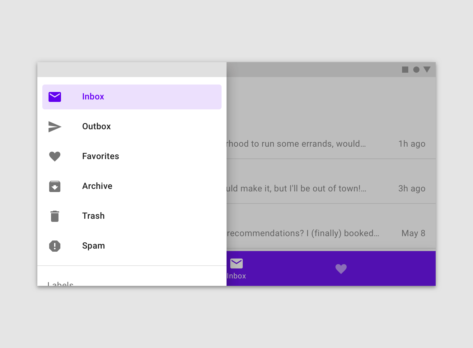
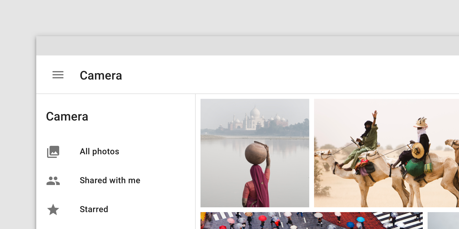
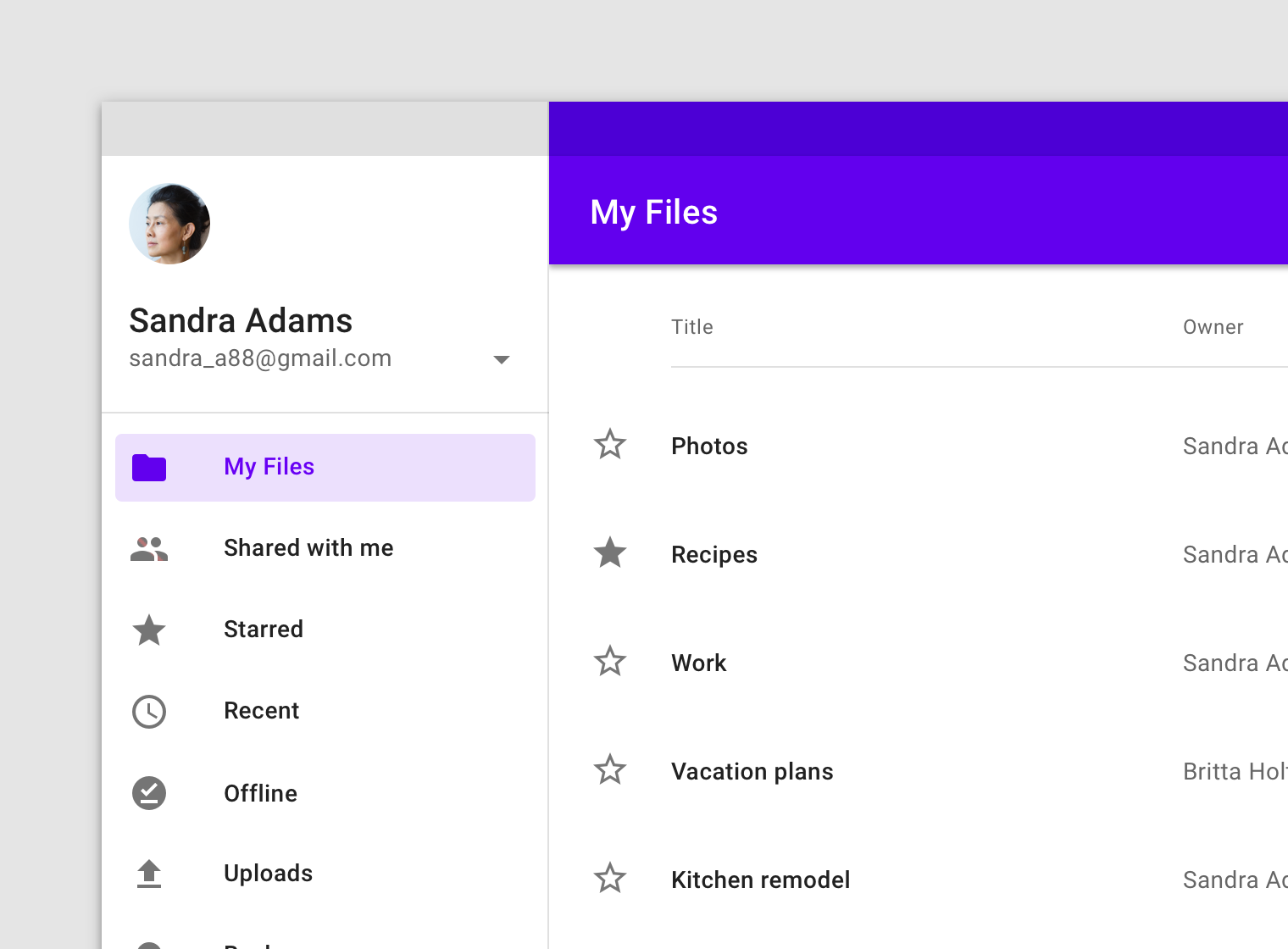
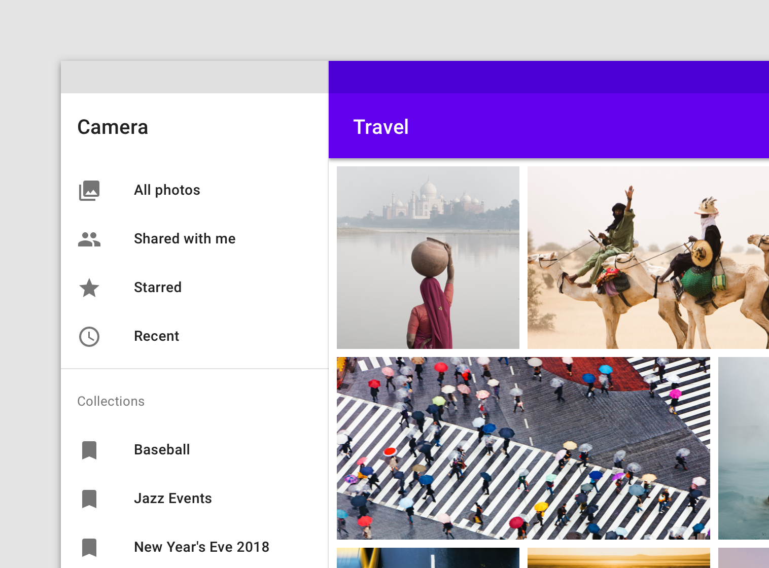
Standard navigation drawers allow users to simultaneously access drawer destinations and app content. They are often co-planar with app content and affect the screen’s layout grid.

Standard drawers can be permanently visible or opened and closed by tapping a navigation menu icon. They can be used on tablet and desktop only. On mobile, modal drawers are used instead.
![](https://storage.googleapis.com/spec-host-backup/mio-components%2Fassets%2F16wwJq_qF5UtX_twrXkC0fUDxGNn1qrlX%2Fusage-types-standard.png)

### Modal drawer

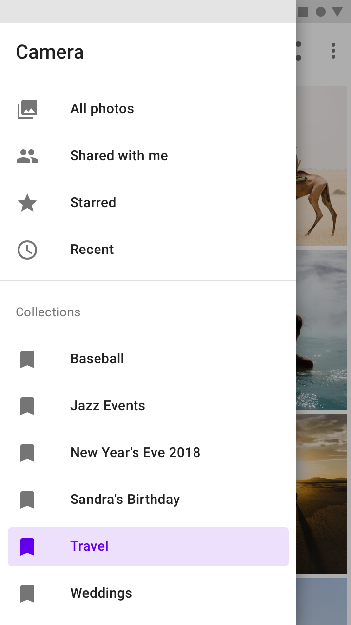
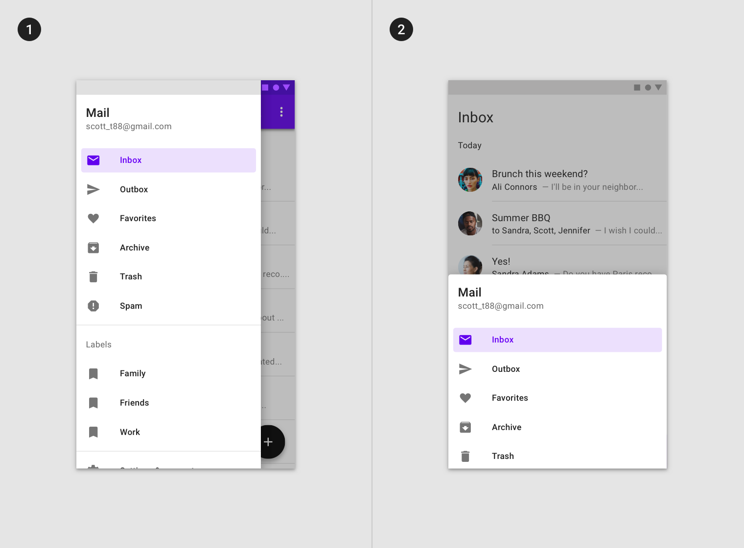
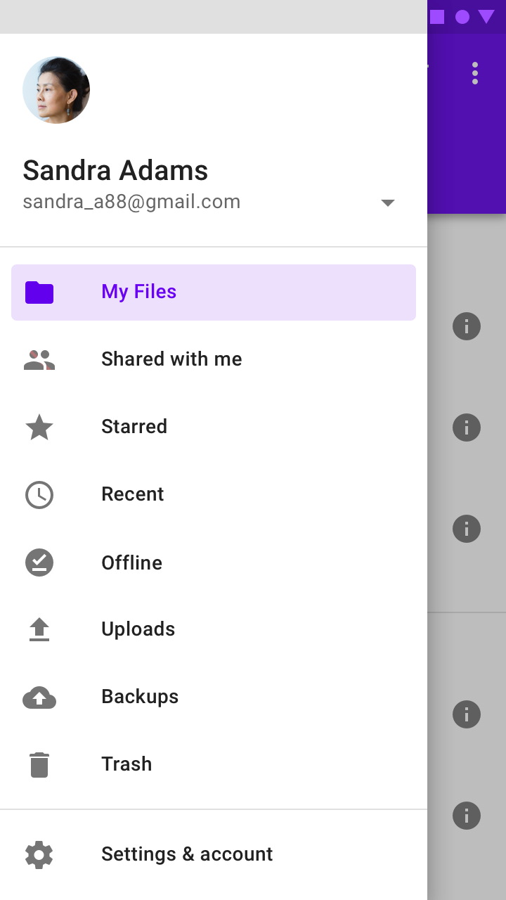
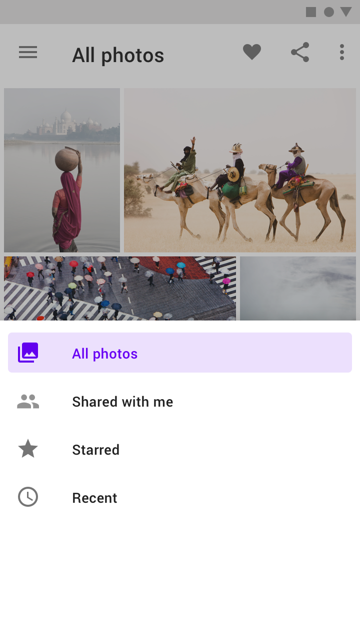
Modal navigation drawers use a scrim to block interaction with the rest of an app’s content. They are elevated above most app elements and don’t affect the screen’s layout grid.

They are primarily for use on mobile, where screen space is limited. They can be replaced by standard drawers on tablet and desktop.

<div align="left"><img src="https://storage.googleapis.com/spec-host-backup/mio-components%2Fassets%2F1PHwyFNxll6s6bJUZTkmqtpBU2LckXu8V%2Fusage-types-modal.png" alt=""></div>

### Bottom drawer

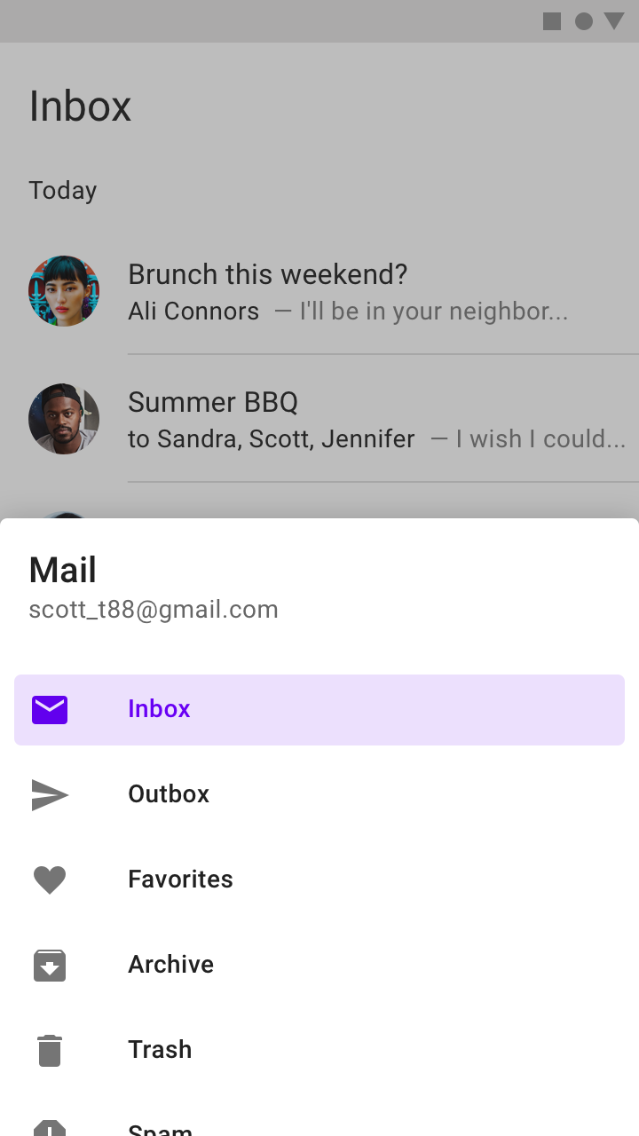
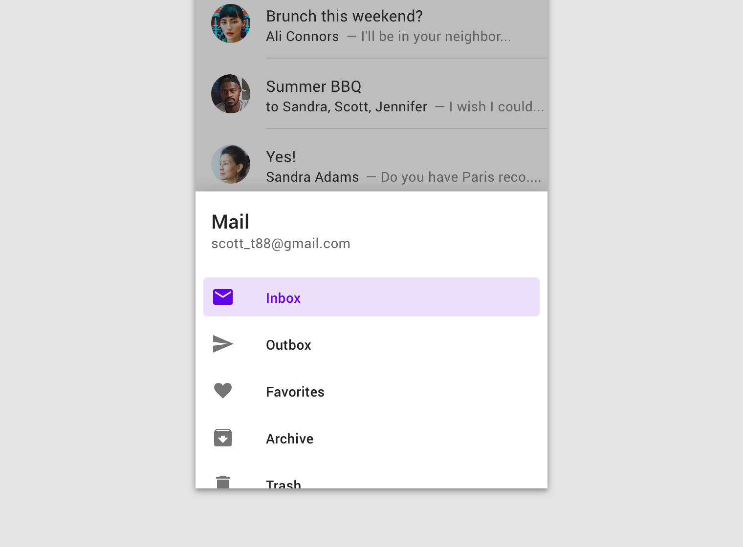
Bottom navigation drawers are a specialized type of modal drawer for use with a bottom app bar.

For increased reachability from the bottom app bar’s menu icon, they open from the bottom of the screen rather than the side.

<div align="left"><img src="https://storage.googleapis.com/spec-host-backup/mio-components%2Fassets%2F11vvo5YFOWBVxYchQG46nS-fcQHwhdFny%2Fusage-types-bottom.png" alt=""></div>

## Anatomy

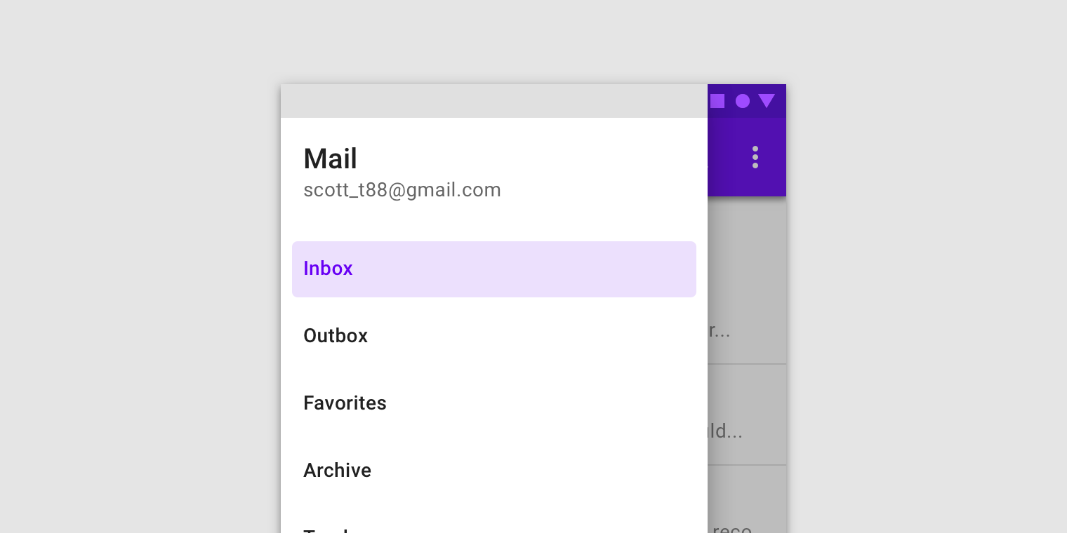
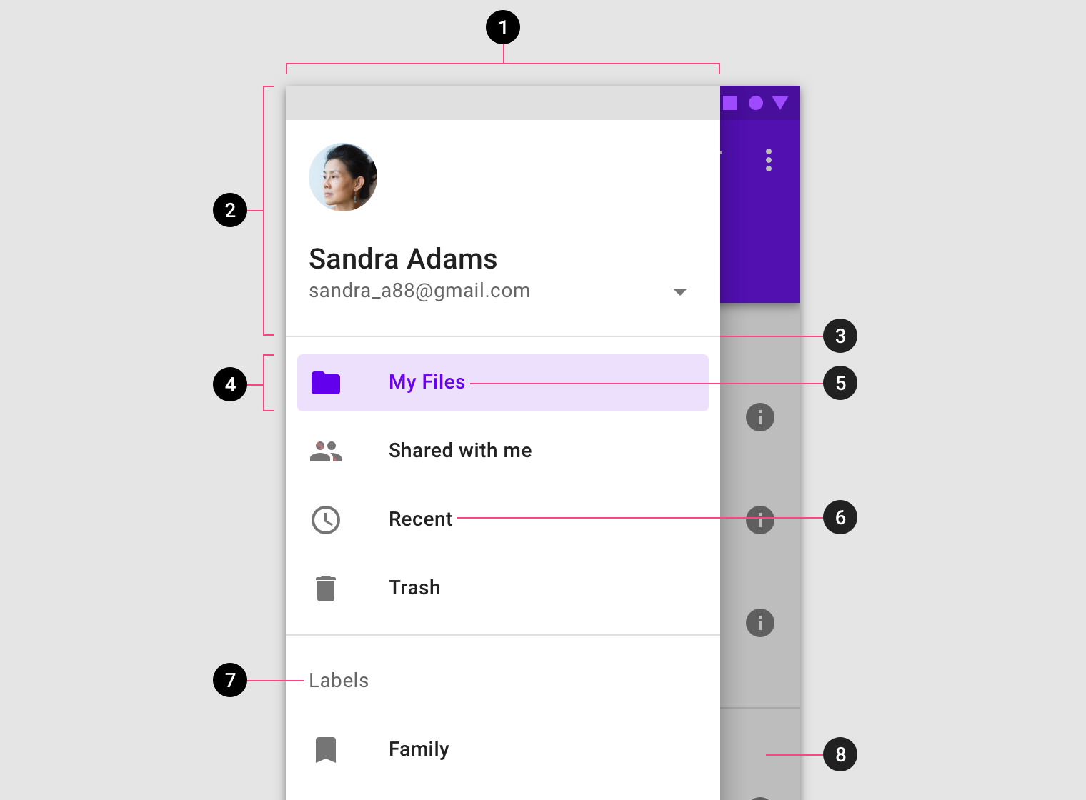
Navigation drawers contain a list embedded within a sheet. They can be enhanced with headers and dividers to organize longer lists.
![](https://storage.googleapis.com/spec-host-backup/mio-components%2Fassets%2F10UGo-uwu3HViW96viJ-EVtV2PSBAF99c%2Fanatomy.png)

1. Container
2. Header (optional)
3. Divider (optional)
4. Active text overlay
5. Active text
6. Inactive text
7. Subtitle
8. Scrim (modal only)

### Sheet

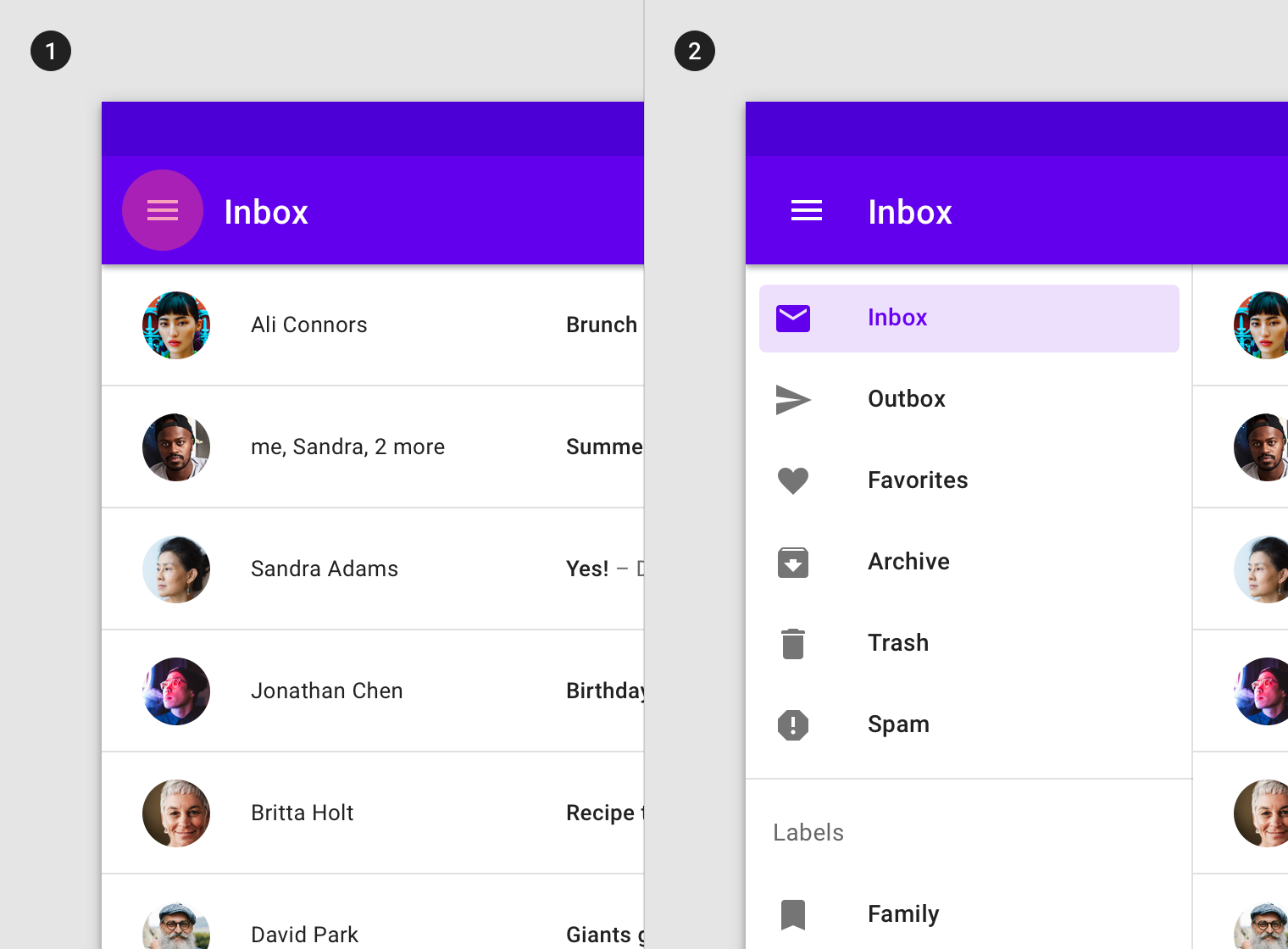
The contents of a navigation drawer are contained within a side or bottom sheet. Navigation drawers that open from the side are placed on the left of the screen for left-to-right languages, and on the right of the screen for right-to-left languages.

<div align="left"><img src="https://storage.googleapis.com/spec-host-backup/mio-components%2Fassets%2F1TGc8PB3-e0up15RseuUgFFVOUk5WLii1%2Fanatomy-sheet-do-alt.png" alt="【Do】A navigation drawer sheet can open from the left side of the screen for left-to-right languages (1), or from the bottom of the screen when paired with a bottom app bar (2). Scaled down to 62.5%"></div>

<div align="left"><img src="https://storage.googleapis.com/spec-host-backup/mio-components%2Fassets%2F1obcmllKi68Uyi3XMO09pAQF_PCsYR5J0%2Fanatomy-sheet-dont.png" alt="【Don’t】Don’t open a navigation drawer from the right side of the screen unless the app is set to a right-to-left language."></div>

###

### Destinations

Destinations in a navigation drawer take the form of actionable list items. Each item describes its destination using a text label and optional iconography.

#### Destination labels

Text labels should be clear and short enough that they aren’t cut off by the sheet.

<div align="left"><img src="https://storage.googleapis.com/spec-host-backup/mio-components%2Fassets%2F1vJWFq71V3b3OuHH5fv88-qreLHscpCWo%2Fanatomy-destinations-labels-no-icons-do.png" alt="【Do】Navigation drawers can use text labels without icons."></div>

<div align="left"><img src="https://storage.googleapis.com/spec-host-backup/mio-components%2Fassets%2F1Geve7a-Dazjy_ZqStJ9vJn4JAj7zONS-%2Fanatomy-destinations-labels-short-do.png" alt="【Do】Keep text labels concise, but truncate them if they extend beyond the container width."></div>

<div align="left"><img src="https://storage.googleapis.com/spec-host-backup/mio-components%2Fassets%2F1excoRXq3CprgnrrSqNyMp-hg1W-lw0cN%2Fanatomy-destinations-labels-wrap-dont.png" alt="【Don’t】Don’t wrap label text."></div>

<div align="left"><img src="https://storage.googleapis.com/spec-host-backup/mio-components%2Fassets%2F1Bnzqt5alX5ZIi4-0DcmYrXu44bVzfQ9m%2Fanatomy-destinations-labels-shrink-dont.png" alt="【Don’t】Don’t shrink text size in order to fit a text label on a single line."></div>

####

#### Destination iconography (optional)

Icons can supplement labels as indicators of a destination. When used, they should always be placed before text. Other app components and content should reference these icons.

<div align="left"><img src="https://storage.googleapis.com/spec-host-backup/mio-components%2Fassets%2F1OrD-5859QC85pWP6ZPAF2m6Gu9yGRKj3%2Fanatomy-destinations-icons-do.png" alt="【Do】Use recognizable icons when conventions exist."></div>

<div align="left"><img src="https://storage.googleapis.com/spec-host-backup/mio-components%2Fassets%2F1dTXibbyG7o272srOo0grtYltAseiO2VV%2Fanatomy-destinations-icons-dont.png" alt="【Don’t】Don’t use the same icon to represent different primary destinations."></div>

<div align="left"><img src="https://storage.googleapis.com/spec-host-backup/mio-components%2Fassets%2F1dTXibbyG7o272srOo0grtYltAseiO2VV%2Fanatomy-destinations-icons-dont.png" alt="【Don’t】Don’t use the same icon to represent different primary destinations."></div>

<div align="left"><img src="https://storage.googleapis.com/spec-host-backup/mio-components%2Fassets%2F14HwXQlqdpo7DRbqciNQfgGH9eyaqvCPP%2Fanatomy-destinations-icons-repeat-do.png" alt="【Caution】Secondary destinations can be represented by the same icon, especially if they are part of a collection (1)."></div>

<div align="left"><img src="https://storage.googleapis.com/spec-host-backup/mio-components%2Fassets%2F14HwXQlqdpo7DRbqciNQfgGH9eyaqvCPP%2Fanatomy-destinations-icons-repeat-do.png" alt="【Caution】Secondary destinations can be represented by the same icon, especially if they are part of a collection (1)."></div>

<div align="left"><img src="https://storage.googleapis.com/spec-host-backup/mio-components%2Fassets%2F1zMCM4ep3aKIodcqkqbFm9XtQTtqIGOPX%2Fanatomy-destinations-icons-some-dont.png" alt="【Don’t】Don’t apply icons to some destinations and not others. Icons should be used for all destinations, or none."></div>

<div align="left"><img src="https://storage.googleapis.com/spec-host-backup/mio-components%2Fassets%2F1zMCM4ep3aKIodcqkqbFm9XtQTtqIGOPX%2Fanatomy-destinations-icons-some-dont.png" alt="【Don’t】Don’t apply icons to some destinations and not others. Icons should be used for all destinations, or none."></div>

###

### Dividers (optional)

Horizontal dividers can be used to separate groups of navigation destinations within the list. They extend across the full width of the drawer.

### Dividers (optional)

Horizontal dividers can be used to separate groups of navigation destinations within the list. They extend across the full width of the drawer.

<div align="left"><img src="https://storage.googleapis.com/spec-host-backup/mio-components%2Fassets%2F1RXP8VTx1QxGIFJzmAUaMLEEmNZPlO9hk%2Fanatomy-dividers-do.png" alt="【Do】Use full-width dividers (1) to separate groups of destinations (2)."></div>

<div align="left"><img src="https://storage.googleapis.com/spec-host-backup/mio-components%2Fassets%2F1Ofkybws17wro2YussaDEcK5eox8FFF-n%2Fanatomy-dividers-dont.png" alt="【Don’t】Don’t use dividers to separate individual destinations."></div>

###

### Header (optional)

The header area of a navigation drawer is a flexible space that can be used for brand expression (such as an app title or logo), an account switcher, and more.

<div align="left"><img src="https://storage.googleapis.com/spec-host-backup/mio-components%2Fassets%2F1JB00-om1_IJ_tMAyMljIa2llAvmUfEoQ%2Fanatomy-header-account.png" alt="【Do】If access to account switching is a priority, an account switcher can be placed in the header area of a navigation drawer."></div>

<div align="left"><img src="https://storage.googleapis.com/spec-host-backup/mio-components%2Fassets%2F14MtgioNSfE0htR4TLiruM0aAIE3IYCC7%2Fanatomy-header-brand-do.png" alt="【Do】If a navigation drawer is the full vertical height of the page, you can place a branding element or product name in the header area."></div>

<div align="left"><img src="https://storage.googleapis.com/spec-host-backup/mio-components%2Fassets%2F15SRa4yHlw1Jtas595J7IGWaybWCAmWoT%2Fanatomy-header-brand-dont.png" alt="【Don’t】If a navigation drawer is clipped by a top app bar, don’t place a branding element or product name in the header. In this case the top app bar is a more suitable place for that content."></div>

###

### Scrim (modal and bottom only)

Modal navigation drawers use a scrim to block interaction with the rest of the app. The scrim is placed directly below the drawer’s sheet and can be tapped or clicked to dismiss the drawer.

<div align="left"><img src="https://storage.googleapis.com/spec-host-backup/mio-components%2Fassets%2F1SwNrGXVgCAcgi4W-HqWIl1h-7ZbZIbdD%2Fanatomy-scrim.png" alt="Scrims applied to a modal side navigation drawer (1) and bottom navigation drawer (2)"></div>

## Standard drawer&#x20;

### Usage

Standard navigation drawers allow interaction with both screen content and the drawer at the same time. They can be used on tablet and desktop, but they aren’t suitable for mobile due to limited screen size.

#### Alternatives

* **Modal drawer:** In a responsive layout grid, at a defined minimum breakpoint of at least 600dp width, a standard drawer should be replaced with a modal drawer.
* **Permanently visible drawer:** When users need to switch destinations frequently (and screen size allows), a permanently visible drawer can be used.
* **Dismissible drawer:** A dismissible drawer can be used when users are likely to focus on screen content and require less frequent access to its navigation destinations.

<div align="left"><img src="https://storage.googleapis.com/spec-host-backup/mio-components%2Fassets%2F1f9ipKy_-QJZpvcKLsGmTk11EfXZwNXRO%2Fstandard-usage.png" alt="A dismissible drawer."></div>

###

### Behavior

#### Scrolling

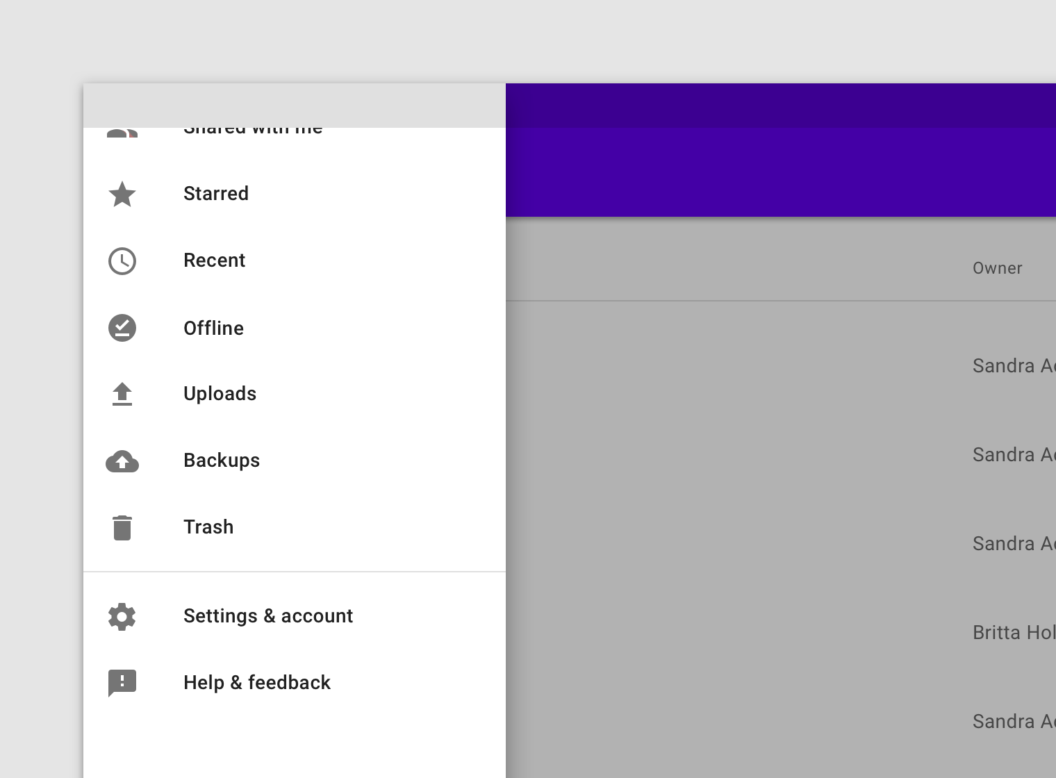
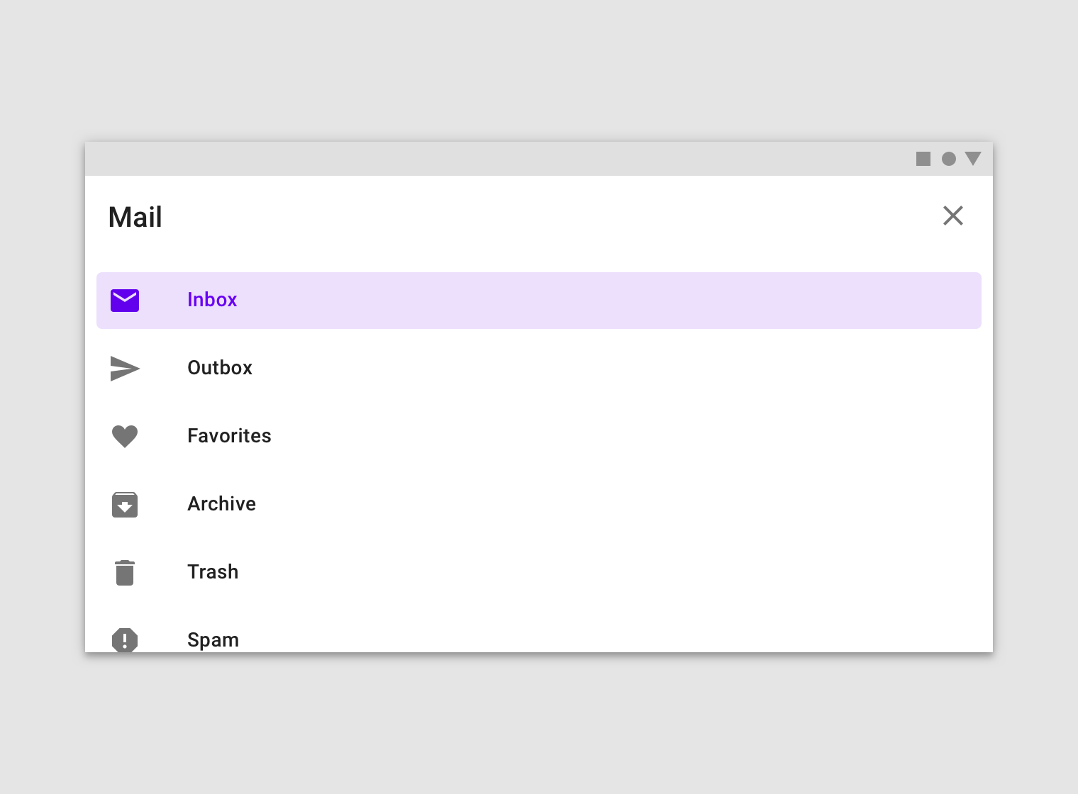
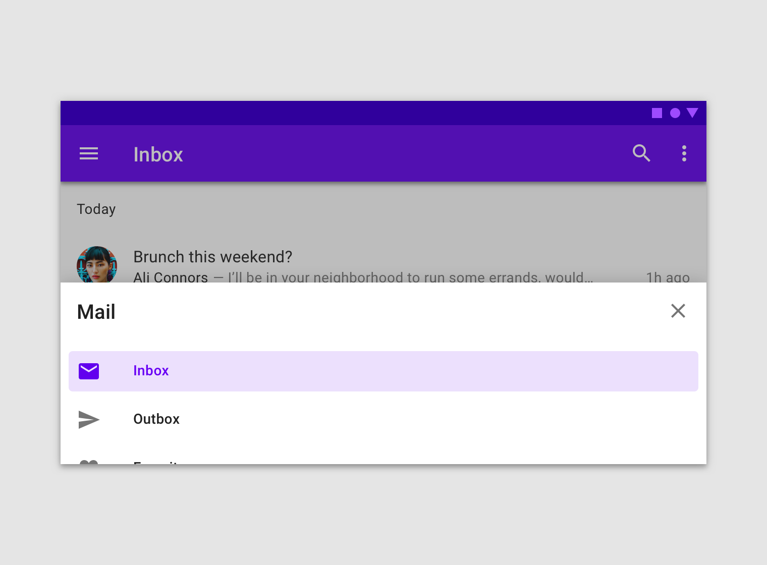
Navigation drawers can be vertically scrolled, independent of the rest of the screen’s content and UI. If the list of navigation destinations is longer than the height of the drawer, the drawer’s contents can be scrolled within the drawer.

<div align="left"><img src="https://storage.googleapis.com/spec-host-backup/mio-components%2Fassets%2F1ZaJemCxLPfaZImDzMItke1G5k95JjBf2%2Fstandard-behavior-scrolling-alt.png" alt=""></div>

#### Visibility

The visibility of a standard navigation drawer depends on screen size, app layout, and frequency of use.

* **Dismissible** standard drawers can be used for layouts that prioritize content (such as a photo gallery) or for apps where users are unlikely to switch destinations often. They should use a visible navigation menu icon to open and close the drawer.
* **Permanently visible** standard drawers allow quick pivoting between unrelated destinations. They require a menu icon for control because they can’t be dismissed by the user.

<div align="left"><img src="https://storage.googleapis.com/spec-host-backup/mio-components%2Fassets%2F1x2NU6vyNNO9oDBAOabnED4ktz_jum_Z_%2Fstandard-behavior-visibility-dismissible.png" alt="A standard dismissible navigation drawer is opened and closed by tapping the navigation menu icon in the top app bar (1), and remains open until the menu icon is tapped again (2)."></div>

<div align="left"><img src="https://storage.googleapis.com/spec-host-backup/mio-components%2Fassets%2F11LVr4y0v_YJj1PqOgGxwFx0riUs2irmu%2Fstandard-behavior-visibility-permanent.png" alt="A permanent navigation drawer on desktop"></div>

### Elevation

A standard navigation drawer can use one of these elevation positions:

* At the same elevation as a top app bar (full-height)
* At a lower elevation than a top app bar (clipped)

#### Full-height

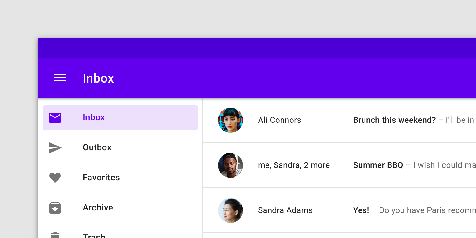
A full-height navigation drawer is at the same elevation as a top app bar.

![](https://storage.googleapis.com/spec-host-backup/mio-components%2Fassets%2F1BWYUFsIrTILjcB9tS10JMDjyLakpNtL3%2Fstandard-elevation-top-app-bar.png)

#### Clipped

A clipped navigation drawer is at the same elevation as content that scrolls beneath a top app bar.

![](https://storage.googleapis.com/spec-host-backup/mio-components%2Fassets%2F1CPoEQp4vBj9aRARuqexAbZhqBxJukOiX%2Fstandard-elevation-below.png)

## Modal drawer&#x20;

### Usage

Modal navigation drawers block interaction with the rest of an app’s content with a scrim. They are elevated above most of the app’s UI and don’t affect the screen’s layout grid.

They are primarily for use on mobile where screen space is limited, and can be replaced by standard drawers on tablet and desktop.

<div align="left"><img src="https://storage.googleapis.com/spec-host-backup/mio-components%2Fassets%2F1oScf-leMqIUFShm_OJlej_iGlMoY1sh7%2Fmodal-usage.png" alt="A modal drawer on mobile"></div>

### Behavior

#### Opening and closing

Modal navigation drawers are always opened by an affordance outside of the drawer, such as a navigation menu icon in a top app bar.

Modal drawers can be dismissed by:

* Selecting a drawer item
* Tapping the scrim
* Swiping toward the drawer’s anchoring edge (e.g. swiping right-to-left for a left-aligned navigation drawer)

<div align="left"><img src="https://storage.googleapis.com/spec-host-backup/mio-components%2Fassets%2F1KW2saB9HeR0oPpmW1KGlthARqnQD-1W4%2Fmodal-behavior-open-alt.png" alt="【Do】A modal drawer is always opened by a navigation menu icon (1)."></div>

<div align="left"><img src="https://storage.googleapis.com/spec-host-backup/mio-components%2Fassets%2F1C9VFN5vG8DdzWk5TygWek9V-fmizl5rN%2Fmodal-behavior-close.png" alt="Modal drawers can be dismissed by tapping its scrim (1) or swiping the drawer toward its anchoring screen edge (2)."></div>

####

#### Scrolling

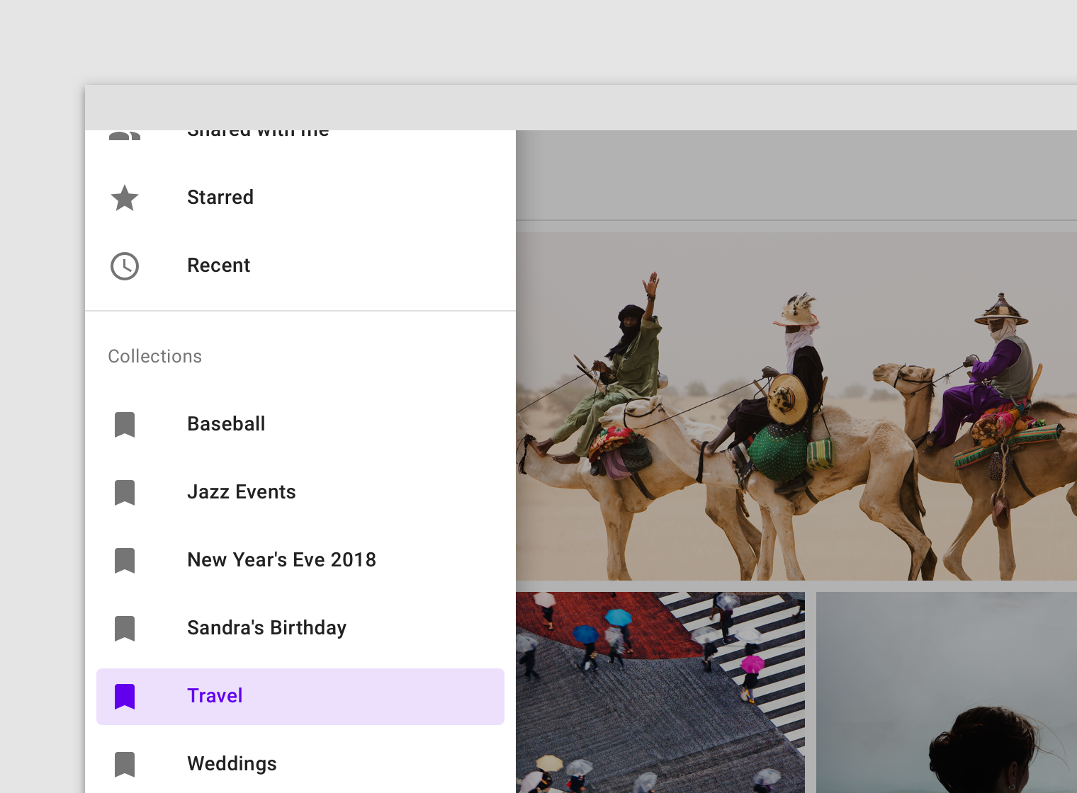
If the list of navigation destinations is longer than the height of the drawer, the list can vertically scroll in the drawer.
![](https://storage.googleapis.com/spec-host-backup/mio-components%2Fassets%2F1hzXs1b-UkwQkMU23wwuzxeqxqfVzeMZK%2Fmodal-behavior-scrolling-do.png)

## Bottom drawer&#x20;

### Usage

Bottom navigation drawers are modal drawers that are anchored to the bottom of the screen instead of the left or right edge. They are only used with bottom app bars.

These drawers open upon tapping the navigation menu icon in the bottom app bar. They are only for use on mobile.

<div align="left"><img src="https://storage.googleapis.com/spec-host-backup/mio-components%2Fassets%2F1742Wr3B-ti0gPi6z_6z0fgepVs9ZR_xI%2Fbottom-usage.png" alt="Bottom navigation drawer"></div>

### Behavior

#### Opening on mobile (portrait orientation)

As with other modal bottom sheets, the initial vertical position of a bottom navigation drawer is based on its content and screen height. They initially cannot open above 50% of the screen’s height.

* If drawer contents are under 50% of screen height, open the drawer to full height at all times
* If drawer contents are greater than 50% of screen height, open them to 50% initially, then allow a user to drag the drawer upward to its full height or screen height (whichever comes first)

<div align="left"><img src="https://storage.googleapis.com/spec-host-backup/mio-components%2Fassets%2F1B0Wjng4N8bGBdQaAjXqod1BXRuGxyUVQ%2Fbottom-behavior-open-portrait-do.png" alt="【Do】Open bottom navigation drawers that contain only a few items to their full height (A)."></div>

<div align="left"><img src="https://storage.googleapis.com/spec-host-backup/mio-components%2Fassets%2F1yhHWBWJzItjMRmguf_IMx0S2j69TWZ1k%2Fbottom-behavior-open-portrait-dont.png" alt="【Don’t】Don’t extend the height of a drawer beyond its contents."></div>

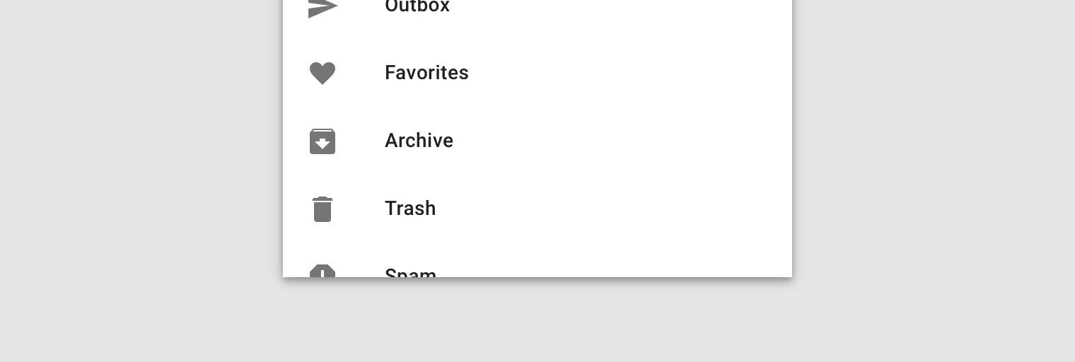
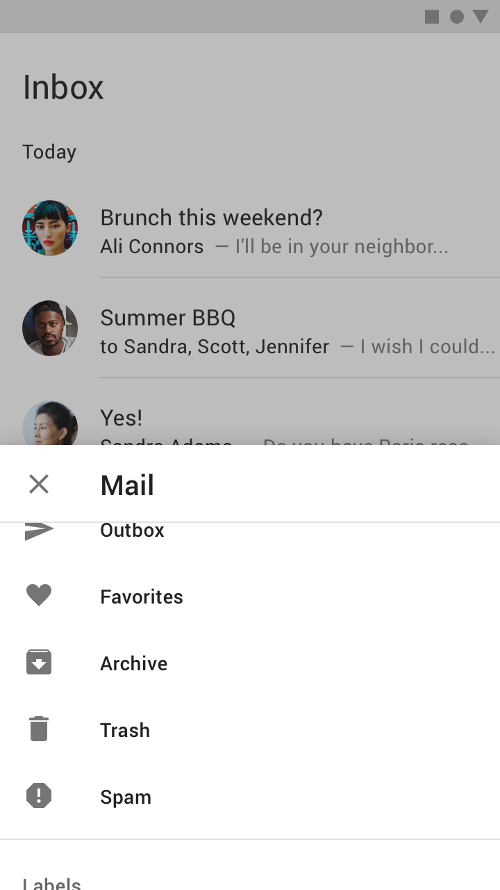
<div align="left"><img src="https://storage.googleapis.com/spec-host-backup/mio-components%2Fassets%2F1hIU6kk6ZY36RAa9yYXKVVSFfh16wQxZX%2Fbottom-behavior-open-portrait-clip.png" alt="【Do】Adjust the opening position of your bottom navigation drawer so the last list item in view is clipped by the bottom of the screen. This can inform users that there are more items to view."></div>

#### Opening on mobile (landscape orientation)

In landscape orientation on mobile, taller bottom navigation drawers automatically open to full-screen mode.

<div align="left"><img src="https://storage.googleapis.com/spec-host-backup/mio-components%2Fassets%2F1JgpygkaPBAjpddopyVQ_wXQ1iA0QMZvH%2Fbottom-behavior-landscape-open-do.png" alt="A bottom drawer opens to full-screen mode on mobile in a landscape orientation."></div>

<div align="left"><img src="https://storage.googleapis.com/spec-host-backup/mio-components%2Fassets%2F1GrwqC0XuhOzyXIQDnDuCbQVb0mjDlG_2%2Fbottom-behavior-landscape-open-dont.png" alt="【Don’t】Don’t open a bottom drawer to half the screen height in landscape mode."></div>

#### Scrolling

Bottom navigation drawers can be internally scrolled once they have been opened to full screen height.

When initially opened to 50% of the screen height, the drawer must be dragged to screen height before additional items are revealed. Upon scroll, the drawer's header becomes an elevated top app bar with a close affordance.

<div align="left"><img src="https://storage.googleapis.com/spec-host-backup/mio-components%2Fassets%2F1z2zqEjg32DpsTSXMFgm86To7b0IZ3qDo%2Fbottom-behavior-scrolling-do.png" alt="【Do】Allow a bottom drawer’s contents to be scrolled when at full height."></div>

<div align="left"><img src="https://storage.googleapis.com/spec-host-backup/mio-components%2Fassets%2F1_3bflMdVFtiBbCLgGxf2ePB-3DVCzJRM%2Fbottom-behavior-scrolling-dont.png" alt="【Don’t】Don’t scroll a bottom drawer’s contents when it’s not at full-screen height."></div>

### Content hierarchy

Because the number of bottom navigation drawer content items aren’t all visible at first, the content of the drawer should be ordered as follows:

1. List items first that are most likely to be frequently accessed by users
2. If an account switcher is used, place it at the top of the drawer

## States&#x20;

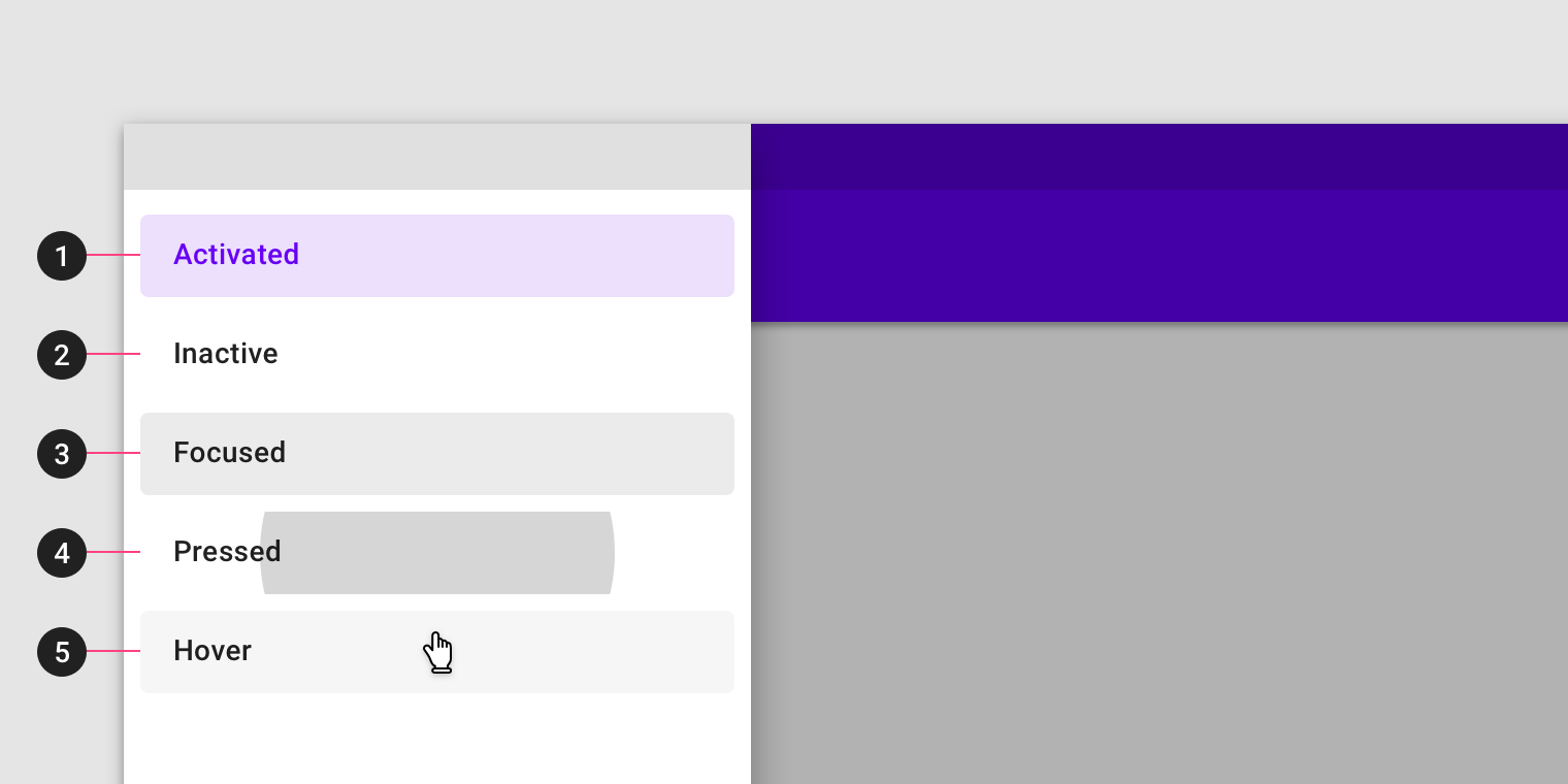
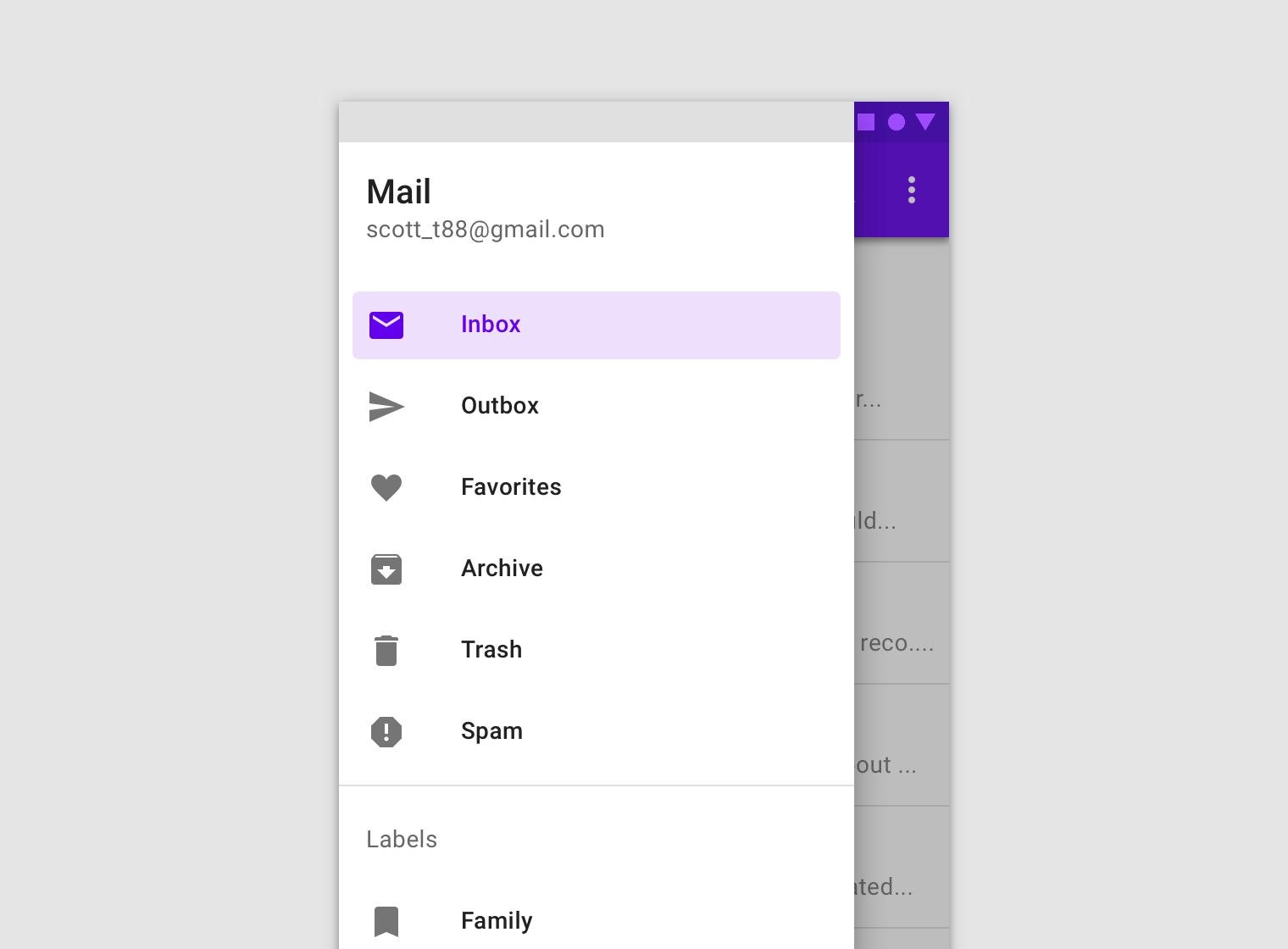
The destinations within a navigation drawer take the form of list items. Each item can be activated, inactive, hovered, focused, and pressed.

<div align="left"><img src="https://storage.googleapis.com/spec-host-backup/mio-components%2Fassets%2F1kpavOX8FbiQDAmJEMb862PrCn61g9oQv%2Fstates-hero.png" alt=""></div>

#### 1. Activated

The current screen, or its parent, is represented with an activated state. Only one item in a navigation drawer can be activated at a time. This state should have strong visual contrast from unactivated items.

#### 2. Inactive

Inactive is the default state for items in a navigation drawer.

#### 3. Focus

#### 4. Pressed

#### 5. Hover
<div align="left"><img src="https://storage.googleapis.com/spec-host-backup/mio-components%2Fassets%2F1IdhQtsni6j0nYktp9_p4Ctb2XW5gECoF%2Fstates-do.png" alt="【Do】Only one drawer item can be activated at a time."></div>

<div align="left"><img src="https://storage.googleapis.com/spec-host-backup/mio-components%2Fassets%2F18q2AjwxBv5PWXZOsCdHsVH1z599fAmYL%2Fstates-dont.png" alt="【Don’t】Don’t activate more than one drawer item at a time."></div>