Sheets: bottom
Bottom sheets are surfaces containing supplementary content that are anchored to the bottom of the screen.
Last updated
Was this helpful?
Bottom sheets are surfaces containing supplementary content that are anchored to the bottom of the screen.
Last updated
Was this helpful?
Bottom sheets are supplementary surfaces primarily used on mobile. There are three types suitable for different use cases:
Standard bottom sheets display content that complements the screen’s primary content. They remain visible while users interact with the primary content.
Modal bottom sheets are an alternative to inline menus or simple dialogs on mobile and provide room for additional items, longer descriptions, and iconography. They must be dismissed in order to interact with the underlying content.
Expanding bottom sheets provide a small, collapsed surface that can be expanded by the user to access a key feature or task. They offer the persistent access of a standard sheet with the space and focus of a modal sheet.
Bottom sheets contain content that supplements the screen’s primary UI region.
Bottom sheets can display a wide variety of content and layouts.
Bottom sheets are easy to reach on a mobile device.
Sheet
Contents
Scrim (Modal only)
Bottom sheets are anchored to the bottom edge of the screen and appear in front of other UI elements. Standard and modal bottom sheets are full-width on mobile and can be inset or full-width on tablet or desktop.
Bottom sheets can display a wide variety of content and layouts, ranging from menu items (in list and grid layouts), to supplemental content laid out according to the layout grid.
Content from a bottom sheet that initially appears below the screen edge can become visible when the sheet is dragged into view.
When bottom sheets initially appear on screen, they may contain content that extends below the bottom of the screen. They can be swiped or dragged up to become full-screen. Depending on the content, bottom sheets can also become full-screen by tapping on their surface or an expand icon.
When full-screen, bottom sheets can be internally scrolled to reveal additional content. A toolbar should be used to provide a collapse or close affordance to exit this view.
Standard bottom sheets co-exist with the screen’s main UI region and allow for simultaneously viewing and interacting with both regions. They are commonly used to keep a feature or secondary content visible on screen when content in main UI region is frequently scrolled or panned.
Standard bottom sheets remain on-screen when a user interacts with the main UI region or the sheet itself. They have a default elevation of 8dp, which allows content in the main UI region behind to scroll or pan and for the sheet to temporarily cover the main UI region when made full-screen. At full-screen height, they should contain a collapse icon in an app bar to return to their initial position.
The contents of standard bottom sheets on mobile can be moved into side sheets on larger screen sizes given the additional horizontal space.
Modal bottom sheets present a set of choices while blocking interaction with the rest of the screen. They are an alternative to inline menus and simple dialogs on mobile, providing additional room for content, iconography, and actions.
Modal bottom sheets are used in mobile apps only.
Modal bottom sheets have a default elevation of 16dp. This elevation allows them to appear over most UI elements and allows them to be pulled up in front of the entire UI to display more options.
A modal bottom sheet causes all content and UI elements behind it to display a scrim, which indicates that they will not respond to user interaction. Tapping the scrim dismisses both the modal bottom sheet and scrim from view.
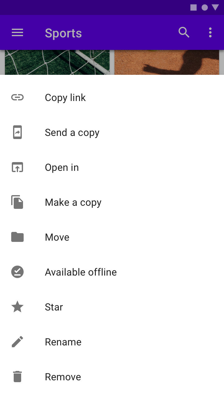
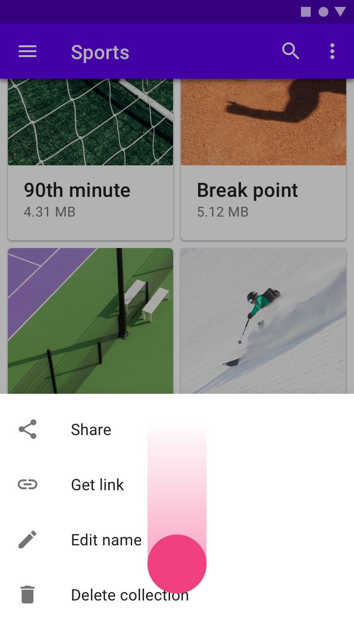
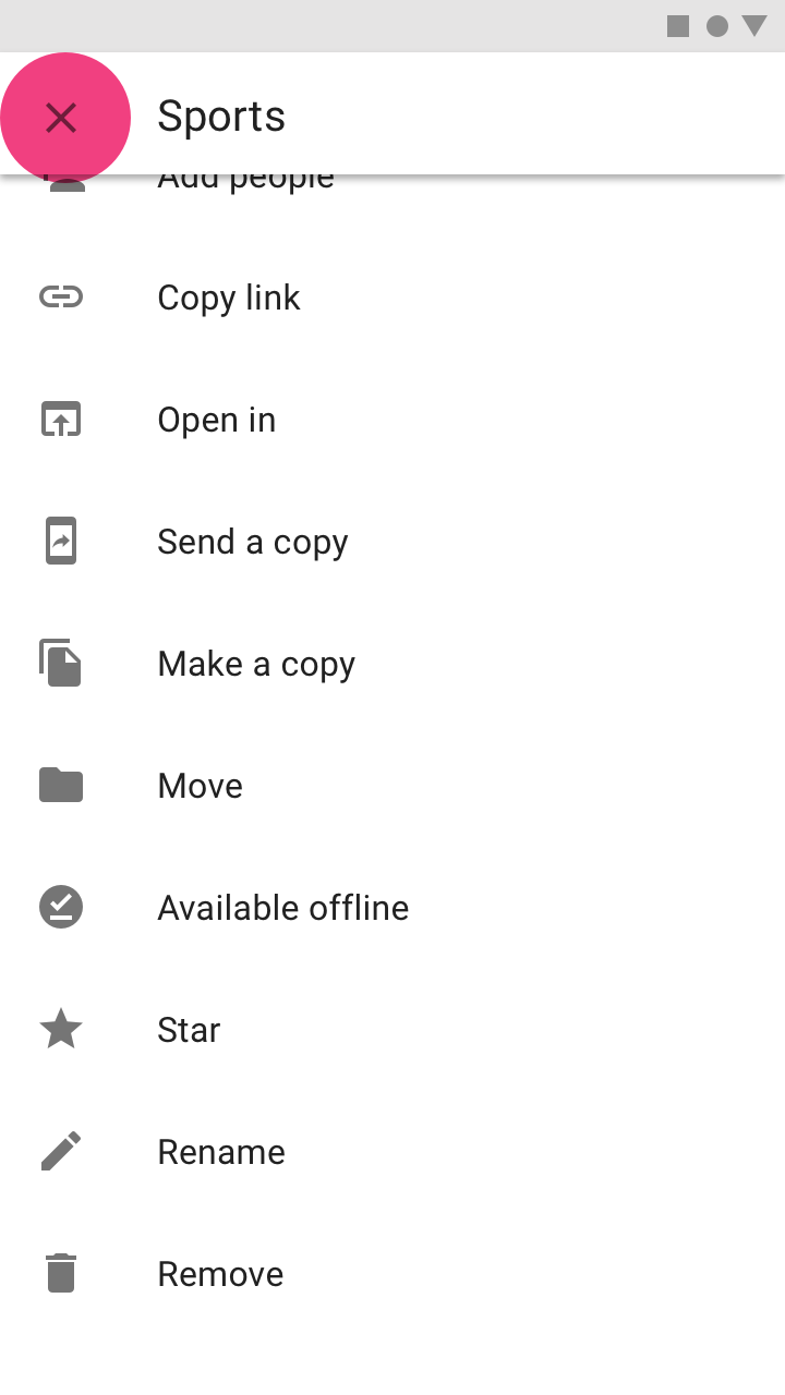
To provide initial access to its top actions, the initial vertical position of modal bottom sheets is capped at 50% of the screen height.
Modal bottom sheets whose contents exceed 50% of the screen height can then be pulled across the full screen, scrolling internally to access their remaining items.
Sheet height
Visibility and behavior
Under 50% of screen height
Visible at full height
50 to 100% of screen height
Partially visibility at 50% of screen height. On scroll or surface tap, reveal full sheet.
Greater than or equal to 100% of screen height
Partially visible at 50% of screen height. On scroll or container tap, move to top of screen and scroll contents internally. Add internal action to close.
Modal bottom sheets appear when triggered by a user action, such as tapping a button or an overflow icon. They can be dismissed by:
Tapping a menu item or action within the bottom sheet
Tapping the scrim
Swiping the sheet down
Using a close affordance within the bottom sheet’s top app bar, if available
Modal bottom sheets are most effective on small screens.
On larger screens, use menus or dialogs to create clear visual connections to the triggering UI element.
An expanding bottom sheet is a surface anchored to the bottom of the screen that users can expand to access a feature or task. It can be used for:
Persistently displaying a cross-app feature, such as a shopping cart
Collecting and acting on user selections from a set of items, such as photos in a gallery
Supporting tasks, such as chat and comments
Indirect navigation between items, such as videos in a playlist
Expanding bottom sheets are recommended for use on mobile and tablet.
Expanding bottom sheets and floating action buttons shouldn’t be used for the same purposes.
Floating action buttons are used for actions only, and they don’t respond to a user’s interaction with the rest of the screen. They can transform into larger surfaces to allow a user to complete an action.
Expanding bottom sheets transform into larger surfaces and can update their content to reflect user interactions.
Expanding bottom sheets are anchored to the bottom corner of the screen. They have two states: a small, collapsed state and a larger, expanded state.
Collapsed state
Container
Icon
Label (Optional)
Expanded state
Header
Close action
Label
Content
When collapsed, an expanding bottom sheet is intended to be small and informative.
It can use shape and color to express that it is interactive.
An icon is required at minimum, and larger screen sizes should also include a short text label.
To avoid blocking content, the width shouldn’t exceed half the screen.
When expanded, an expanding bottom sheet is full-screen on mobile (1), but can be smaller on tablet and desktop based on its content (2).
It contains a fixed header with a title and an affordance to collapse the sheet.
Expanding bottom sheets can be expanded and collapsed.
When collapsed, the entire container is interactive, and tapping it expands the sheet.
Once expanded, the sheet displays an app bar with an action icon that enables collapsing the sheet. In addition, it can display a contextual action in the sheet that completes a task, such as “Checkout”, “Submit”, or “Download” buttons.
Expanding bottom sheets are fixed to the bottom, trailing corner of the screen to minimize obstructing the screen’s main content.
On mobile devices, an expanding bottom sheet affects other bottom-aligned components. It could obstruct important features such as bottom navigation, or create confusion when placed next to a floating action button.
The following recommendations suggest when and how to pair an expanding bottom sheet with nearby components:
Component
Pair with an expanding bottom sheet?
Recommendation
Bottom navigation
Caution
Place a collapsed sheet above bottom navigation. Hide bottom navigation on scroll and when a sheet expands.
Bottom app bar
No
A bottom app bar would obstruct a collapsed sheet.
Floating action button: Regular
No
Collapsed sheets have similar size and placement as floating action buttons, which may confuse users about the usage of each.
Floating action button: Extended
Caution
An extended floating action button can be used if center-aligned, so it doesn’t overlap with a collapsed sheet. The button width and collapsed sheet should both be short and styled differently from one other.
On-screen keyboard
Yes
When the keyboard appears, it covers the sheet. When the sheet is collapsed, it doesn’t attach to the keyboard.
Snackbar
Yes
To avoid overlap, place a snackbar above a collapsed sheet.
On larger screens, expanding bottom sheets don’t need to expand to the screen’s height or width. At a smaller size, expanding bottom sheets enable multi-tasking and other uses of screen space.
As their placement at the bottom of the screen may make them less noticeable, their content can be placed in a side sheet or accessed from a top app bar.